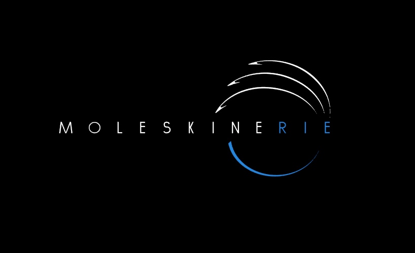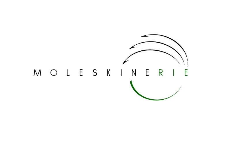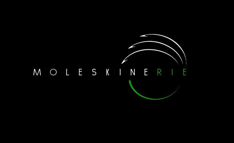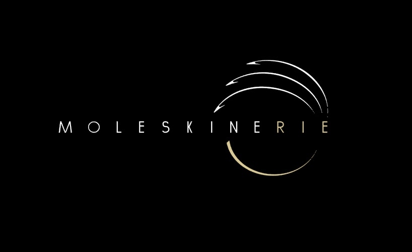
Moleskinerie Logo by matteo paolini from italy
designer's own words:
The logo wants to express the concepts of imagination and journey, culture and memory. The lines are smooth and elegant, easily recognizable. The top reminds the shape of a book, closely related to the image of Moleskine notebook, that keeps inside the everyday life of everybody. The bottom show the half of a circle, icon of the world, symbol of journey. The connection between these two parts represents the identity of Moleskine brand, containing all the meanings of its philosophy.
The logo is made to be adapted to any background, using only two colours, one that underlines MOLESKINE brand and the top of the logo, the other for the circle and the suffix “rie” that refers to the Moleskine blog. The colours used, in addition to black and white according to the background, are blue, green and brown, main chromatic shades of the earth. The logo is versatile, reproducible and it can be differentiated changing colours and backgrounds.