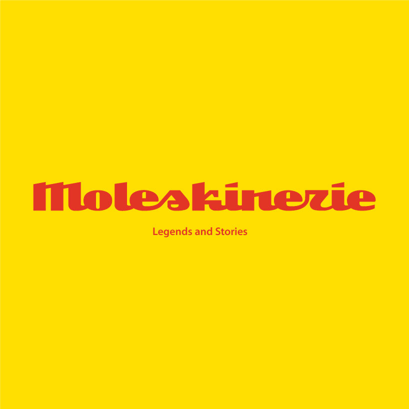
Moleskinerie logo by ivan kostynyk from canada
designer's own words:
This project started with a sketch. The concept was to create a logo that resembled handwriting and yet maintain the properties of a logotype. There were 2 concepts generated, one with traditional "s" and an "r" and a egyptian styled "s" and an "r". It was quite challenging to keep the balance and kern the letters in a harmonious manner. The personal benefit that I gained out of this project is the possibility of taking this logotype further and develop and entire font. Alone, I believe this logo stands as a solid concept for the Moleskinerie blog and supports the purpose of the "blog" as a medium of the communication.
black on white
 black and white
 color version
shortlisted entries (2162)