
moleskinerie logo by vasco godinho from portugal
designer's own words:
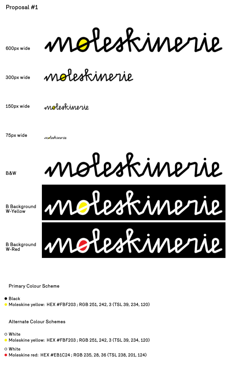
we chose to combine a mechanical calligraphic rendering of the theme with the irregular and surprising elements of hand-writing, achieving a form that that we think is reminiscent of ball-point calligraphy (regular stroke), both precise and irregular, and reminiscent of the uses
and possibilities of a notebook - thus connecting the moleskinerie brand to our contemporary
outputs in communication, business, arts, etc - in short, all the fields of creativity that the brand services and wishes to represent. to strenghten that relationship, we incorporated recognizable elements from the moleskine brand in the design: namely distinctive moleskine colour-
schemes and a graphical approach to a whimsical, free-style calligraphy that recalls the elastic closure and bended corners of the moleskine notebooks.
proposal1
 proposal2