moleskinerie logo by Halei Liu from denmark
designer's own words:
as mentioned in the abstract, the logo is trying to express the product image by its own way. in order to achieve this, i only used the basic visual element, dots, lines and shades. it create a perfect reflection on the notebook image, so no further explanation is needed, it is all in the image itself.
the logo
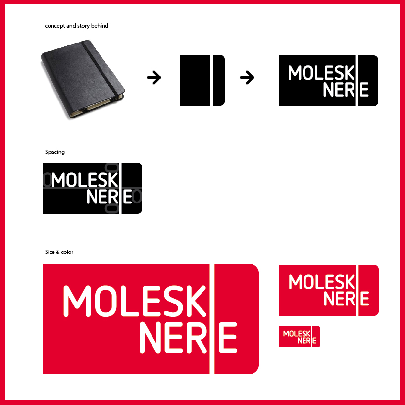 concept
 logo in ad
 logo in print
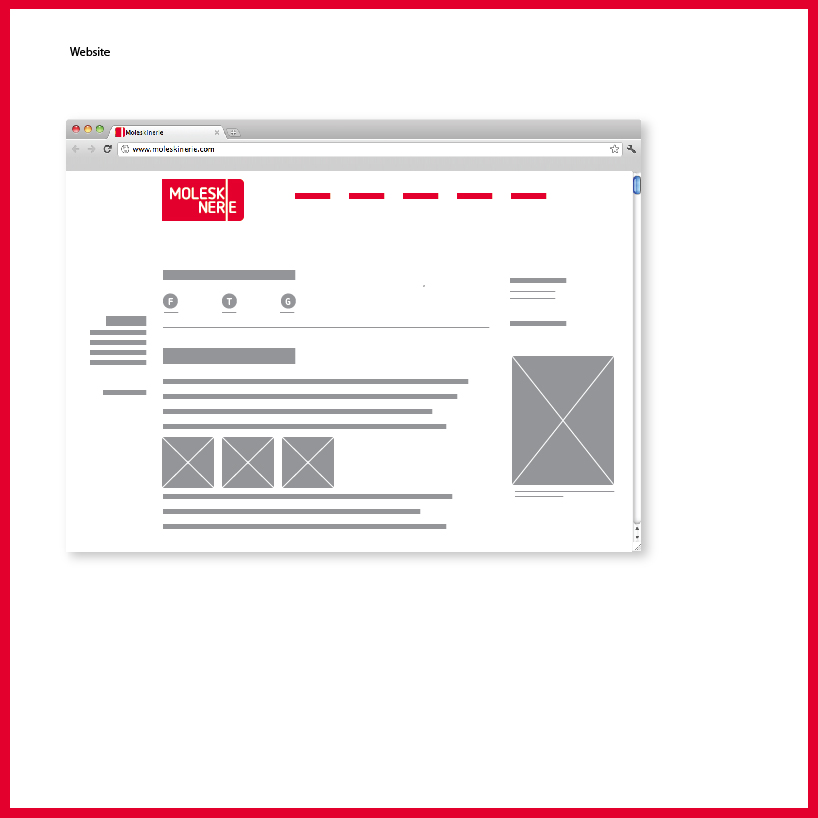 logo in web
shortlisted entries (2162)