moleskinerie logo by andre meca from portugal
designer's own words:
moleskine is one of the most reputable brands when it comes to sketchbooks, it's personality draws the creativity of many individuals around the world. through it's essence as a companion and creative ideas book, i decided to create an image that reflects the method of the natural and primordial forms. in this case, a blog, i began brainstorming and come down to three keywords that identify's with the sharing of information between user and author in this digital platform, and they are "simplicity," "share" and "stories". from this analogy, combining the three keywords with individuals, arrived in three basic forms, all different, trying to demonstrate the uniqueness and individualism in each of these. the three basic forms arise by the same sense as are initially created, are the source of all forms, all creative thinking. the typography used is akzidenz-grotesk, black, reinforcing the starting color of the moleskine sketchbook, a picture of how it all began.
logotype
 simple colors
 black white
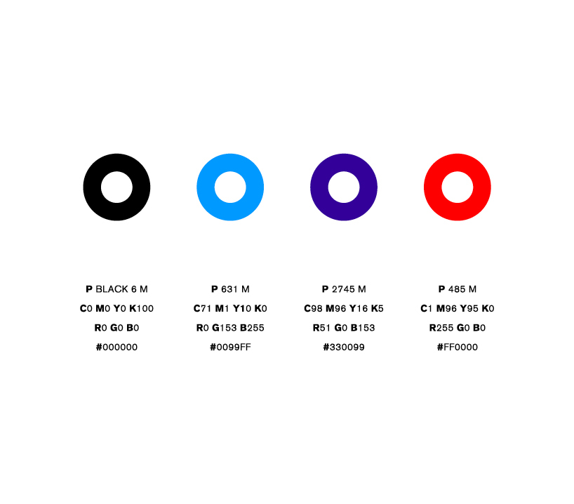 colors
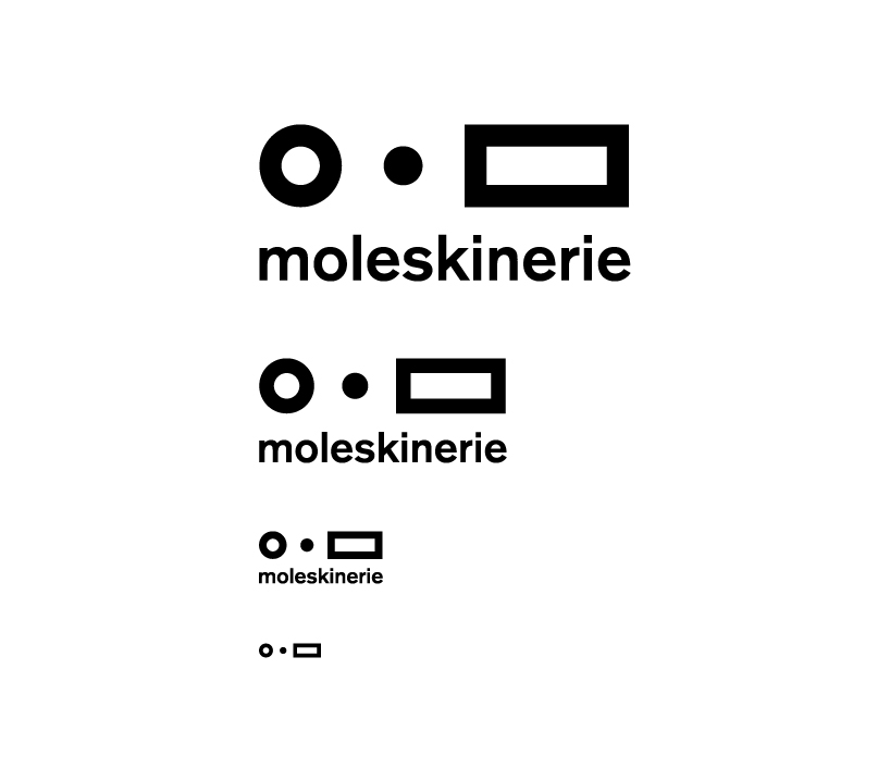 minimum size
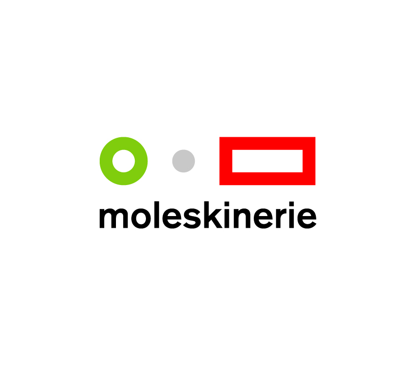 italian colors