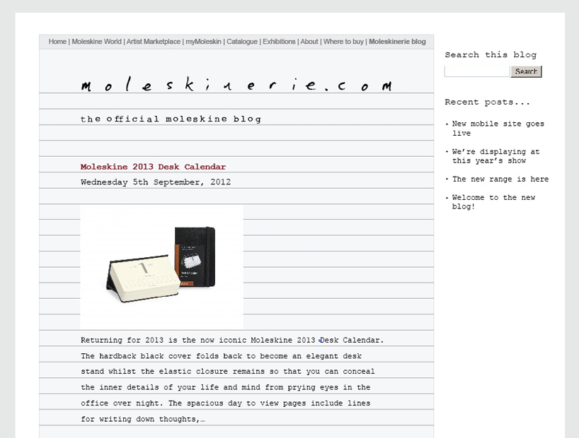
Moleskinerie Logo by william grindall from uk
designer's own words:
i have created a logo which naturally links reality with the virtual blog-space. it has a tangibility which leaps out of the page, and helps users leap into the blog - forming a natural bond between moleskine and its customers.
creating a warmth that no font could ever do, the logo brings into focus the tactile nature of moleskine products.
the logo fulfils a visual imperative of making the user feel at home - somewhere you can think, plan and record ideas.
moleskinerie logo
 website appearance
shortlisted entries (2162)