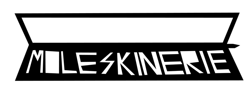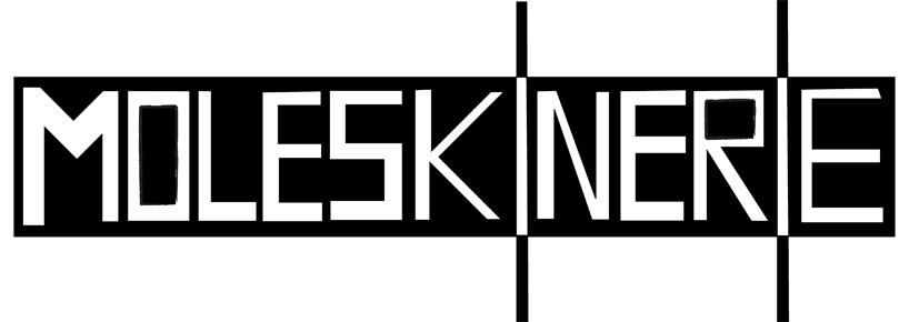
moleskinerie logo by jon lexing tan from australia
designer's own words:
i have used adobe illustrator for all six images. this concept is based on the shape and design of the moleskine book, in which i have combined the letter 'i' and the elastic used to seal the book as one element, and have included the principle of closure in this. i have used an artistic style of handwritten typography to resemble the type of content found in the moleskine. in some designs, i have used watermarked lines behind the letters to resemble the side of the moleskine book. the rectangle in which emphasizes the word 'moleskinerie' is wrapped around to resemble the label which is in the packaging to describe the book specifications. the images are combined into one shape and is in black and white so that colors can be changed easily in order to blend in with the surrounding media.
logo 1
 logo 2
 logo 3
 logo 4
 logo 5
 logo 6