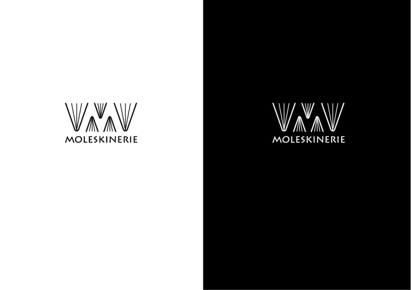
Moleskinerie logo 3 by corina rosca from romania
designer's own words:
for this 3th moleskinerie logo i used the same font like in my second logo proposal.
this font is related with the one from the moleskine logo. the text looks clean, it’s easy to read and it suggests the moleskine logo style so it’s easier to make the connection. also, the typeface that has a slightly serif-ish appearance, belongs to the past in the same way like it belongs to the future, which is so characteristic of the moleskine products.
the graphic symbol is a “m” for Moleskinerie made of open notebooks. the increasing perspective used makes the logo monumental, balanced, simple and representative.
Moleskinerie logo 3
shortlisted entries (2162)