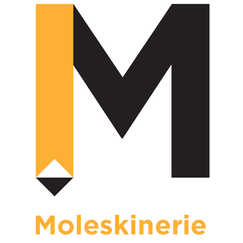
Moleskinerie Logo by catarina rodrigues from portugal
designer's own words:
My logotype for Moleskinerie was inspired by the book marker that every Moleskine has. I took the "M" from the word (Moleskinerie) to make it the main element in this new logo. We can see that one part of it is the tradicional book marker, that belongs to the picture. Besides, the triangle that comes out of it, was inverted and at the same time we can also see that part of the "M" as a pencil, the main writing object, used to draw or write.
The type I used is sans-serif to bring to the image some freshness and strength. The type is very easy to read, so it works perfectly on the internet.
I used the black and orange because they are both strong colors, with very good legibility. The orange is also a color that we associate to energy, power and is very positive. The general logo is a modern version of Moleskine logo and I think it makes all sense, once it will be used in platforms usually used by younger people. It is also very simple and meaningful.


