moleskinerie logo by yayan anugrawan from indonesia
designer's own words:
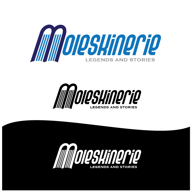
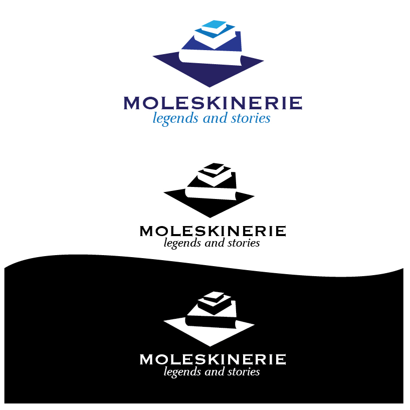
- logo no.1 was inspired by two books where the book spine is located at the top. composition of these books formed the letter “m” which is initial letter of moleskinerie.
- logo no.2 was inspired by opened book with colorful papers
- logo no.3 was inspired by outline of opened book where the outline become the letter “m”
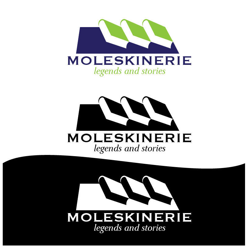
- logo no.4 was inspired by composition of three papers and become the letter “m”
- logo no.5 was inspired by shadow of a pile of three books with different sizes
- logo no.6 was inspired by shadow of a pile of three books with same sizes viewed from the side. composition of these three books especially at the book cover formed the letter “m”
moleskinerie logo 01
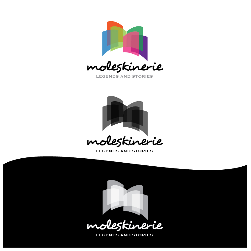 moleskinerie logo 02
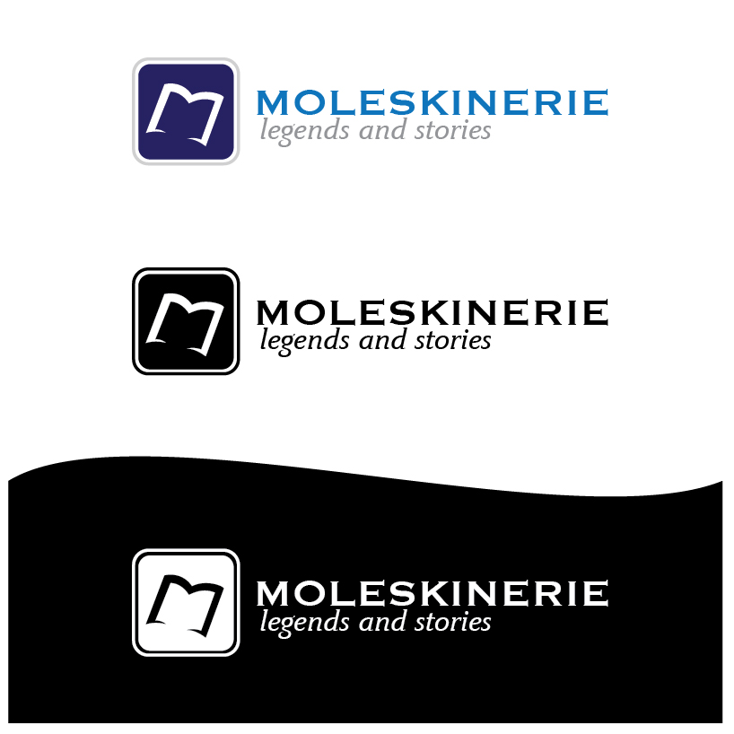 moleskinerie logo 03
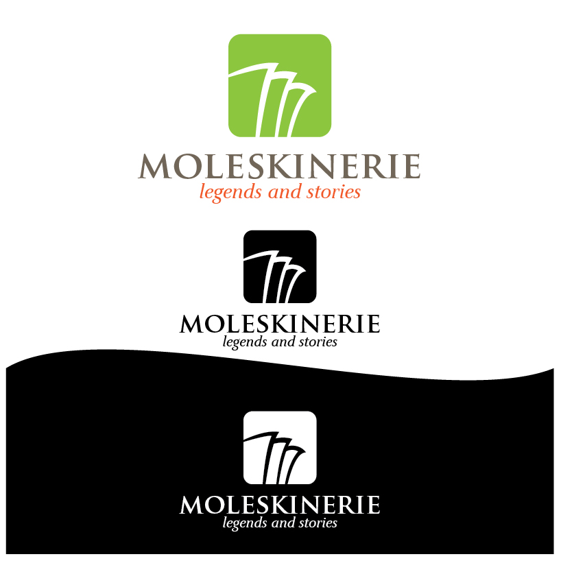 moleskinerie logo 04
 moleskinerie logo 05
 moleskinerie logo 06