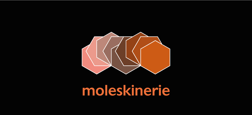
Moleskinerie Logo by vicente castanon-rumebe from canada
designer's own words:
the hexagon was an ideal shape to create the letter m without it being too literal. the colour palette is kept neutral to keep the seriousness of the company.
Moleskinerie 1
 Moleskinerie 2
shortlisted entries (2162)