moleskinerie logo by goran lizdek from bosnia-herzegovina
designer's own words:
in present day, a blog culture shares many similarities with a timeless and classic moleskine notepad - it's an instant representation and a mirror of someone's thoughts, emotions and ideas. in that sense, the logotype should be also a representation of that, hence the logotype is based on a concept of a simple sketch, a work in progress, or just a rough idea. the typography used is helvetica neue which, as a moleskine, is a timeless classic too and perfectly complements the idea of simplicity.
the logotype retains that organic and human feeling and is void of any synthetic elements or over-the-top visual treatment.
Logotype
 Logotype with slogan
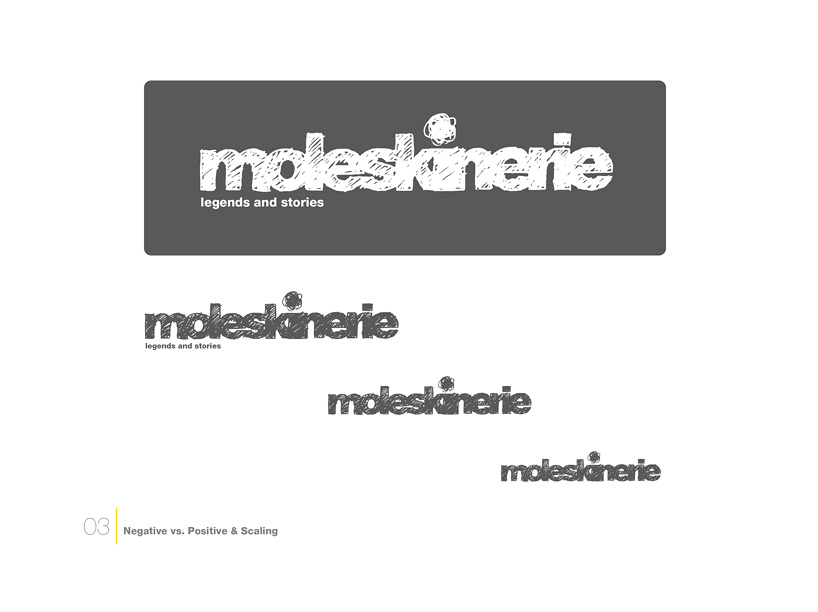
 Negative vs. Positive & Scaling
 Text layout
shortlisted entries (2162)