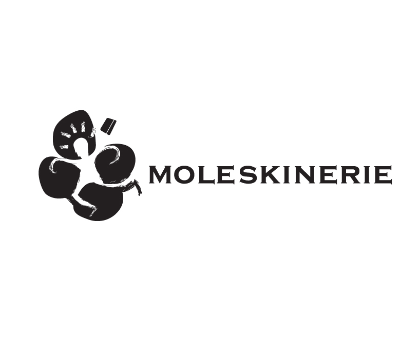
Moleskinerie Logo by Bernardo Marinho from portugal
designer's own words:
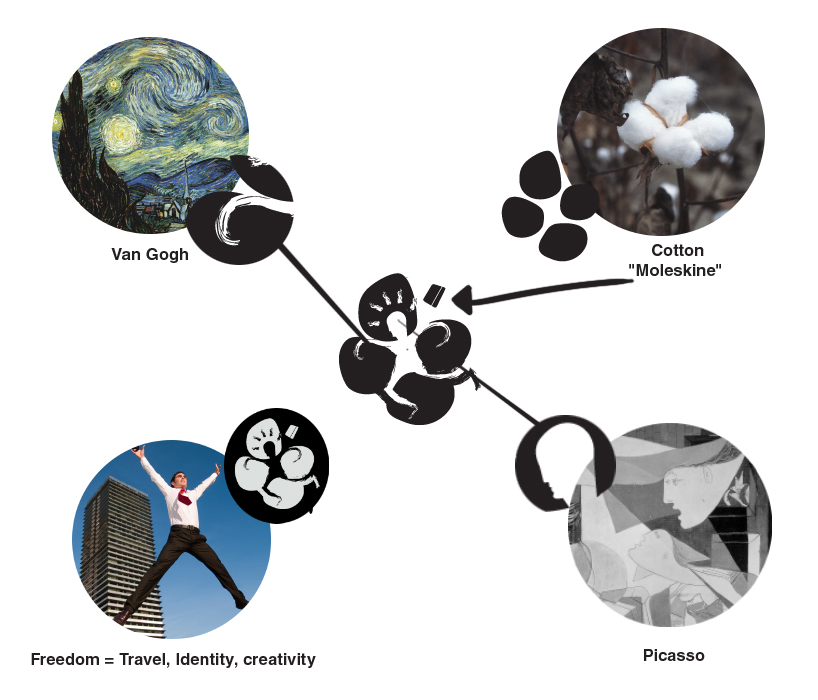
The Logo for Moleskine inspired by their brand concepts and values, Van Gogh, Picasso and Cotton!
Made for Web and possibly print, keep in mind that Moleskine is for creatives of any kind, people that value freedom, and the possibility of noting all their progress, ideas, meetings,etc..
You can seee Van Gogh in the strokes, picasso in the head, cotton in the back ground shape.
The figure in the negative space represents freedom and identity.
Van Gogh and Picasso stand for art and technology, and both, a different way to see the world.
the cotton represents the "Moleskine" green and eco values and much probably the origin of the word "Moleskine", from what I believe, the inside of the books were covered.
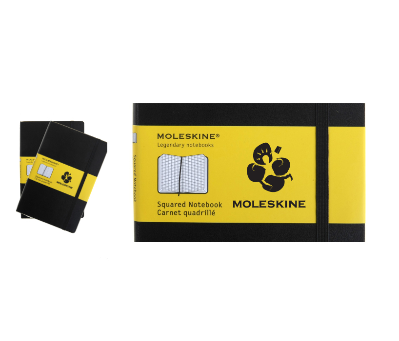
IN the logo You have different textures, the stroke (paint and pencil), the rectangular shape (that is the moleskine), and straight lines (roughness), because for me and for many the texture in the books are part of their magic, being the paper in side or the cover and elastic band.
Logo
 History
 Inspiration
 Website
 Books
Books
 Last
Last