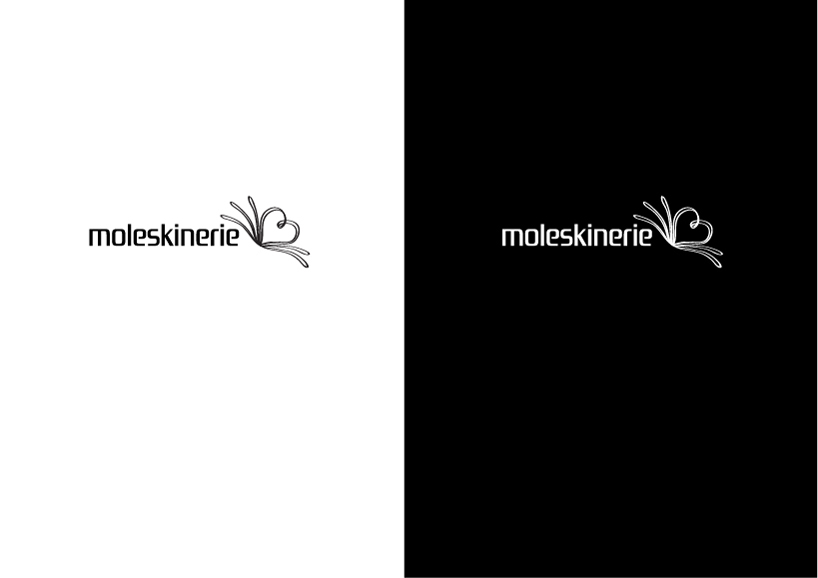
Moleskinerie logo 1 by corina rosca from romania
designer's own words:
for this moleskinerie logo i used a font that reminds me of the the moleskine notebook shape. the text looks clean, it’s sans-serif, it’s easy to read and the round corners makes it very friendly and moleskin-ish.
i used a graphic symbol in the shape of an open notebook with the two pages building a heart because the blog is addressed to all the moleskine lovers and fans from around the world.
Moleskinerie logo 1
shortlisted entries (2162)