MOLESKINERIE IS PRECIOUS ! by marta latini from italy
designer's own words:
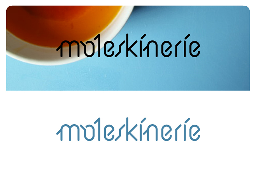
To create this logotype i started from two different elements. The first is a diamond: its perfection and its synthetic look had something in common with the Moleskine's products. The other element is something more abstract and geometrical: the rounded corner, so typical of the classic Moleskine.
logo
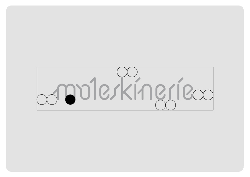 margins
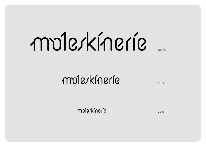 reductions
 positive and negative
 color
color
shortlisted entries (2162)