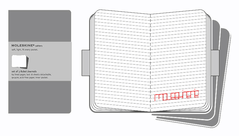
moleskinerie is a trace made of lines by erica rodriguez from spain
designer's own words:
moleskine has a carefully, simple and recognizable image. a product of moleskine doesn´t need to carry associated the word "moleskine" to be recognized as such. the combination of straight and curved lines, the use of a single color, simplicity in design and the pragmatism, make their design unique and unmistakable.
the proposed logo, with two variants, try to collect all these ideas. the logo is proposed to be perceived like a drawing made of letters instead of a word. moleskinerie must have their own typography, designed by drawing lines. these letters are drawn with straight and curved lines and a single color. white and black are the colors chosen for this example, but can be replaced by any other color.


shortlisted entries (2162)