moleskinerie identity by joao loureiro from portugal
designer's own words:
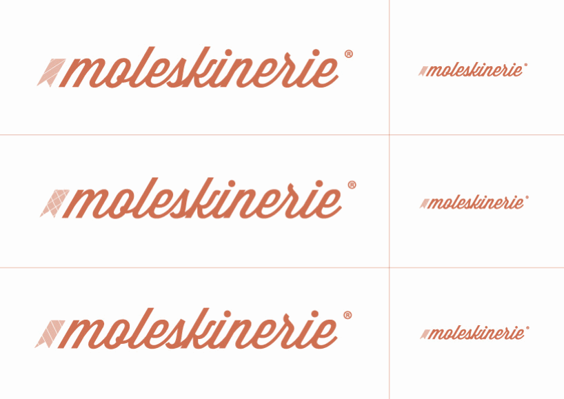
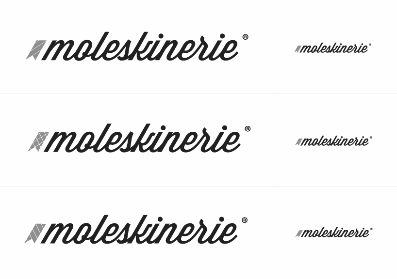
with this proposal i decided to develop a consistent and dynamic identity that can be applied in multiple ways. the graphic element present in the identity refers to the famous moleskine® notebook. since the "moleskinerie" is now represented in orange color I chose to keep it presented but with a new shade. in the sent proposal it’s also demonstrated how the brand behaves in different ways and in various media. i think it's a strong identity and that meets the brand philosophy.
cover (negative logo)
 project description
 logo (color)
 logo (black and white)
 blog design
 symbol variation
shortlisted entries (2162)