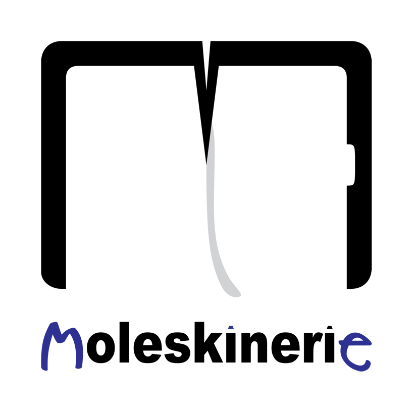
moleskinerie for me by novica milenkovic from serbia
designer's own words:
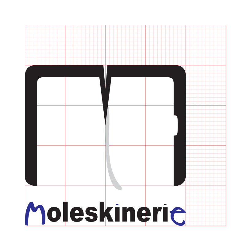
the symbol: redesigned outline of the notebook should resemble outline of the capital letter m for moleskine. design is slim and smooth and should associate to modern products. to emphasize it’s a notebook there is a page reminder in the middle. page marker can be noted on the right side and there is no marker on the left side. it indicates that the notebook is open on the first page and the message should be: moleskine has provided me with the first step and it’s up to me to fill in the notebook with whatever my interests are.
moleskinerie typography: two letters are standing out: "m" and "e". these legendary notebooks are for me, from beginning to the end, my personal resort, whether i’m an artist, student, businessman or i just like to draw, doodle, scribble, write down important stuff, organize my time and work or organize my travels. and who wrote those letters "me"? well it was "i" (letters "i" are pens, inspired by design of moleskine pens). also color of the letters is blue, because it should associate to the color of ink, thus something handwritten and again personal.
logo with typography
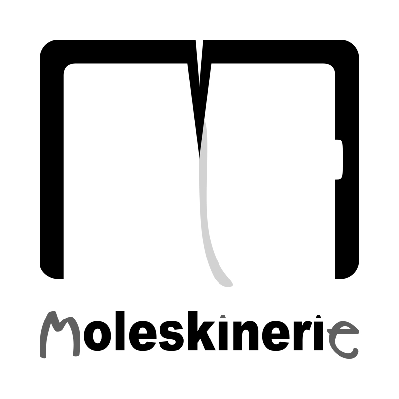 grayscale
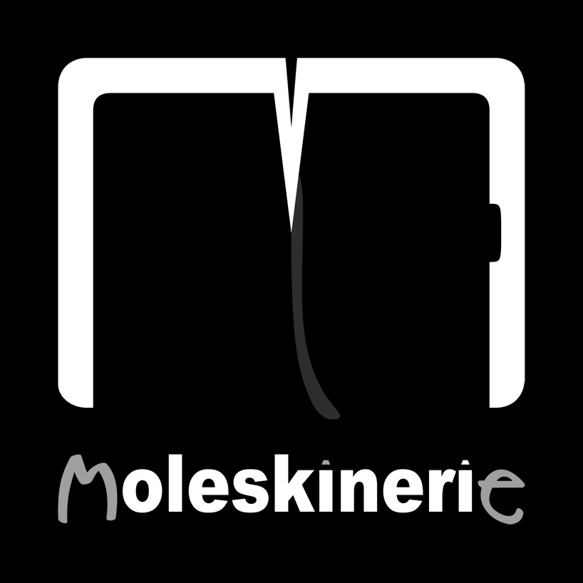 invert
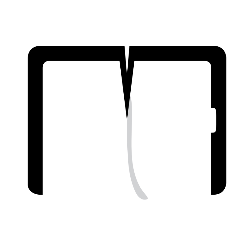 just logo
 logo and typography on grid