moleskinerie emot_icon by dominik banaszak from poland
designer's own words:
the idea of the moleskinerie logo was to create a most synthetic graphical representation of the legendary moleskine notebook which could be easily applied in virtual reality. for that purpose an emoticon seemed as a perfect solution for its simplicity and common use. emoticons have become a part of the universal language of today - when handwriting is being replaced by typewriting a combination of simple keyboard keys must suffice to express one's feelings or leave a short message. like a good logo, emoticons are both simple and recognizable. moreover, reducing graphics to typeface gives an opportunity of most flexible use in various fields of visual communication. [ |] moleskinerie emot_icon logo is easy to scale, colour and background are interchangeable, it can be even used in a different typeface and still remains recognizable.
the legendary product becomes an icon. the icon becomes an emot_icon.
[ |] moleskinerie emot_icon.
front page
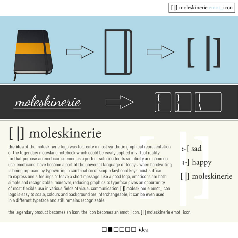 idea
idea
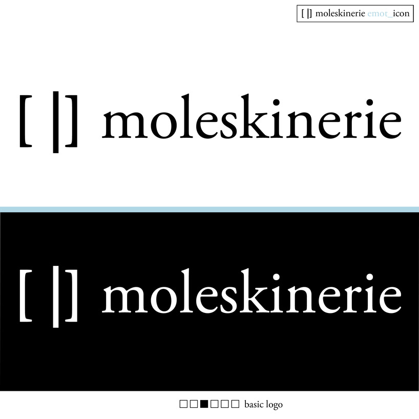 basic logo
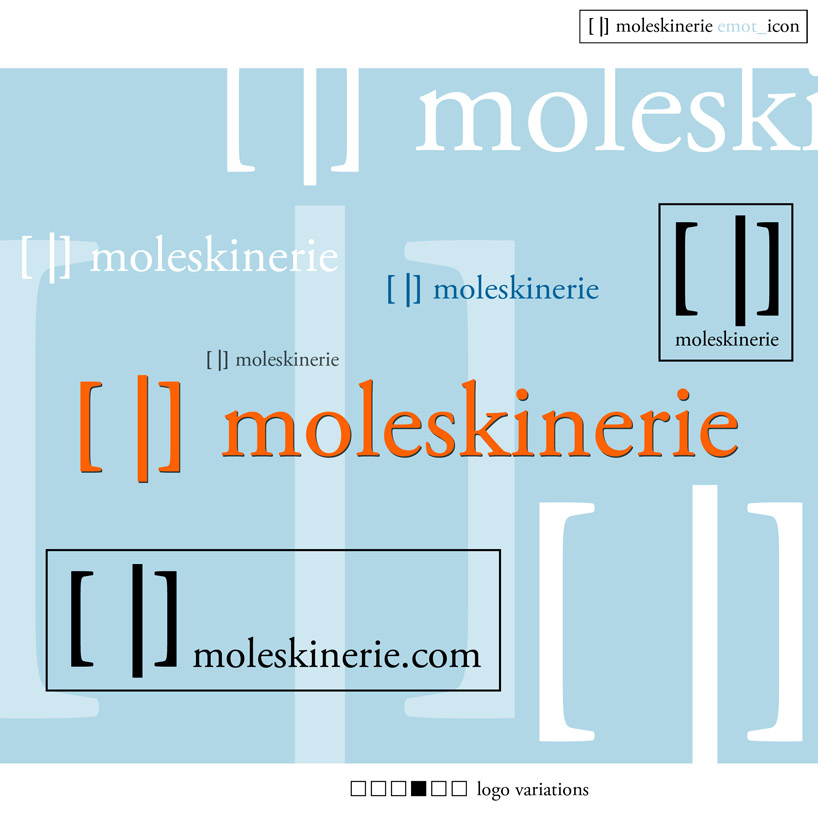 logo variations
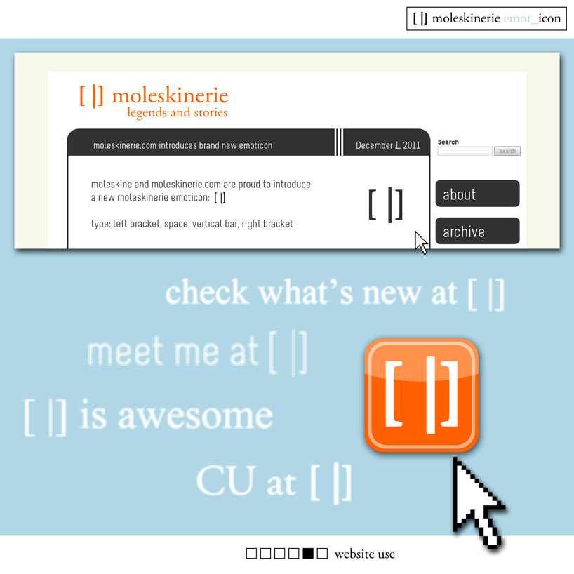 website use
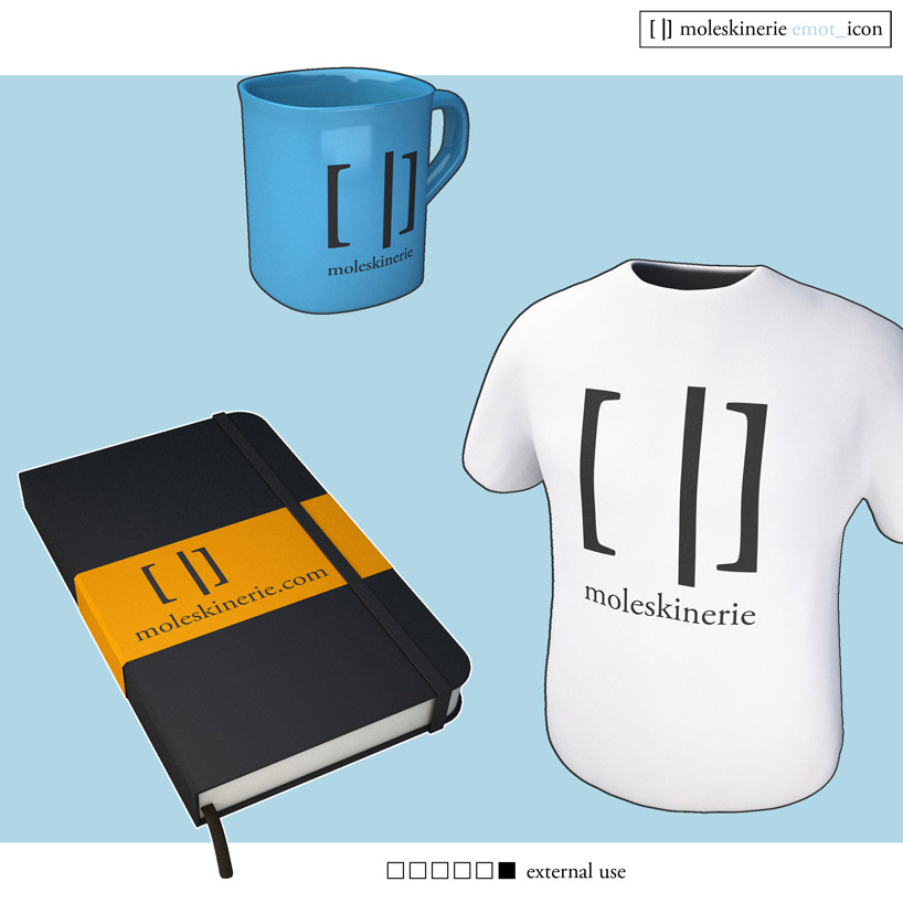 external use