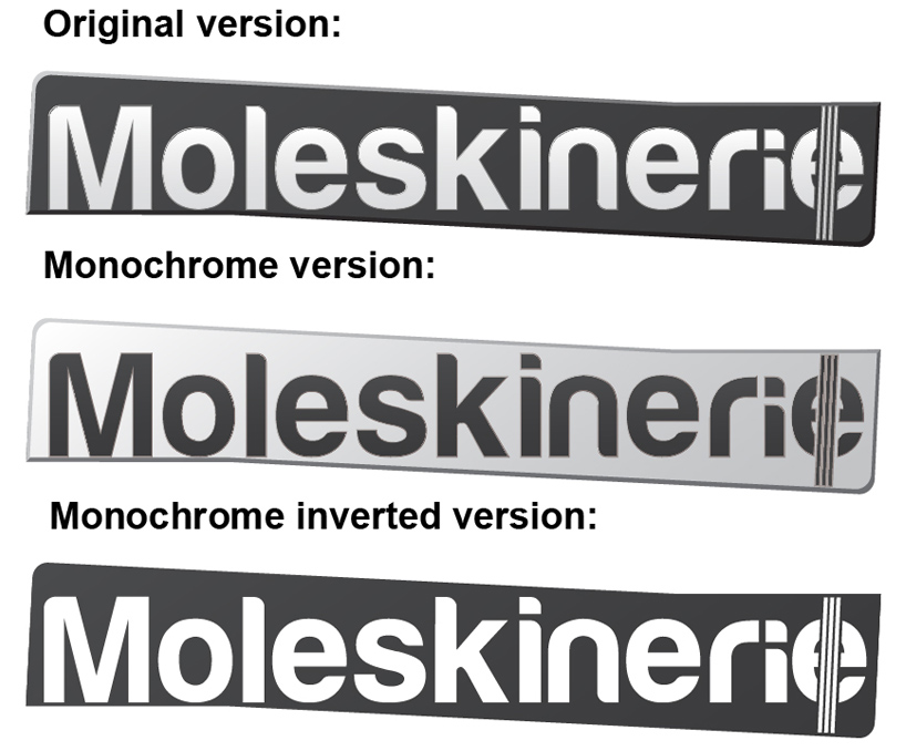
Moleskinerie elastic lines logo by miguel diogo gomes from portugal
designer's own words:
to start this project, i sought information about the product that best defines this company. anyone who knows or has heard of the brand Moleskine, knows it, essentially for their notebooks. these books succeeded the legendary notebooks used by artists like vincent van gogh, pablo picasso, ernest hemingway, hence the slogan "legendary notebooks." with this in mind, i looked for what all their notebooks had in common and what made them unique. a black book with rounded corners, an expandable pocket on the inside and its one of a kind elastic page-holder. no other book of this kind has the same characteristics. in all moleskine notebooks, regardless of the variations, all have a rubber band. so, i thought incorporating it in my work would be crucial.
the external structure is my representation of the notebook in a simplified and slightly adjusted way to better incorporate with the text, with a slight effect of light and shadow.
regarding the company's name, I chose a font itself with a slight fragrance of moleskine, with simple lines, rounded corners on some letters and more importantly, a very readable font. still in the company name i chose the same effect used in the structure so that both would connect in a harmonious way. as for the color used, i opted for a monochrome palette, for reproducibility purposes, making it possible to use on any background and with any color.
Original version of the logo
 Inverted color version of the logo
 Simplified version of the logo
 All versions of the logo