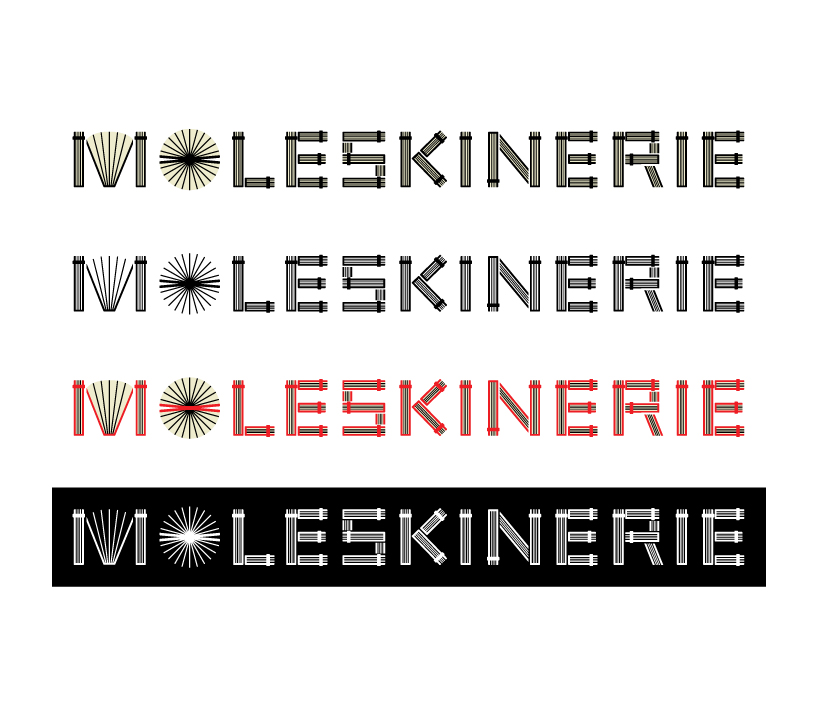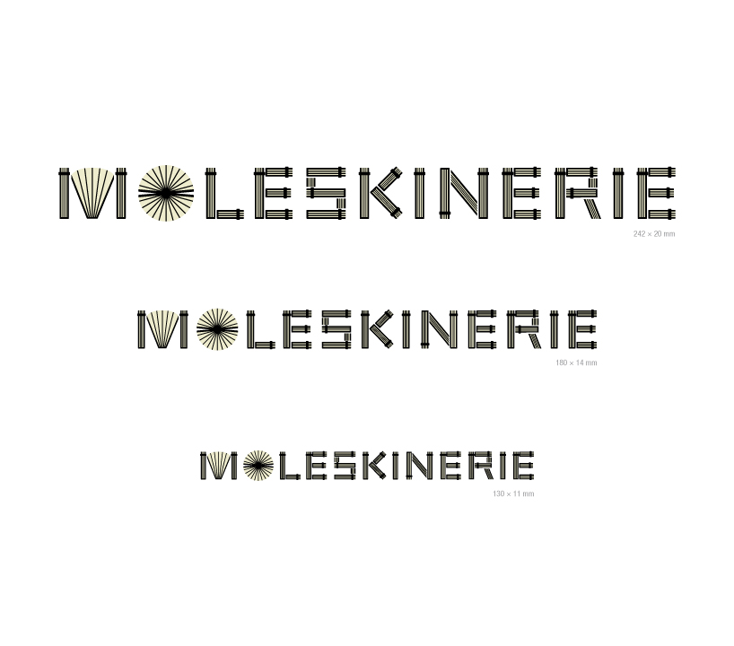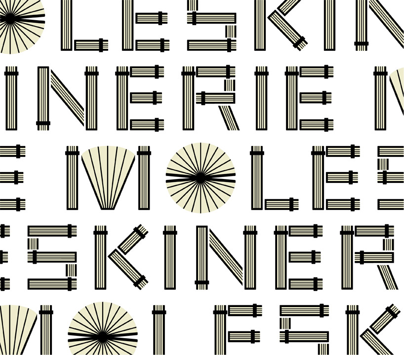
moleskinerie by MOLESKINE by shiro inoue from japan
designer's own words:
the shape of the product of moleskine itself is a symbolic icon of a notebook and a diary.
the subtle yellow paper, the solid hard cover, the round corner, the rubber band etc.
i thought that It might have a unique atmosphere if these specific elements are used in the logo for moleskinerie.
in the proposal, all letters are consisted of the simplified elements of moleskine.
further, I wanted to express the tidy atmosphere of moleskine by using many lines in the logo.
logo
 colour applications
 size applications
 pattern application
shortlisted entries (2162)