Moleskinerie by José Bronze by jose bronze from portugal
designer's own words:
as a student of the politecnico di milano, born in portugal, my influences are many but, in this case, i tried to apply simplicity the best i could.
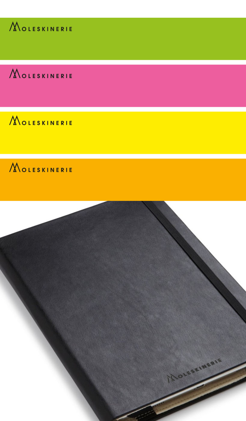
in my opinion, the design should be recognizable (as the main 'm' is), easy to use in the usual applications given to the moleskin logo - such as engraving on the leather covers - and so on...
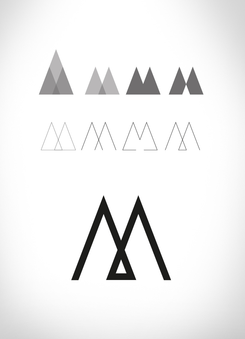
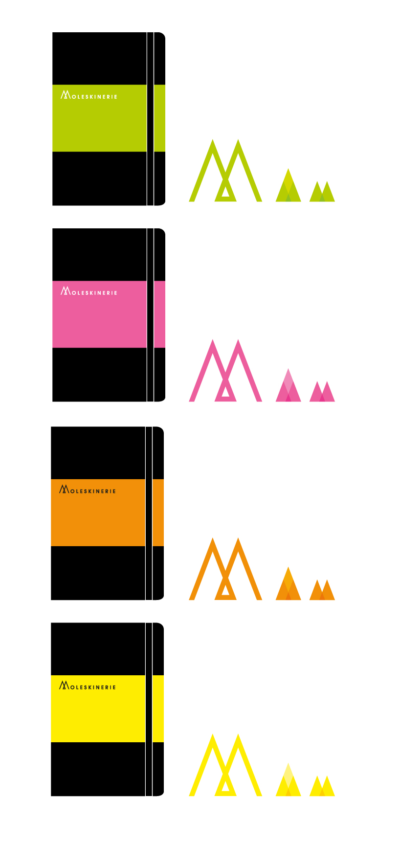
firstly drawn by hand and finally designed with vectorial drawing software, this logotype allows moleskin to have many faces according to any given situation - be it different types of notebooks or, even, for different ways of printing.
giving the 'm' an iconographic value lets the brand to be recognized by a symbol and not only for its name, thus strengthening its impact on the general public.


shortlisted entries (2162)