Moleskinerie are ideas. by niccolo galimberti from italy
designer's own words:
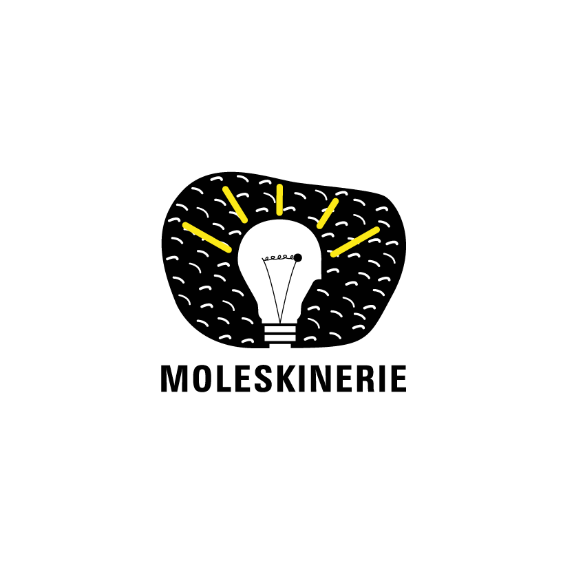
Realize a logo for a blog belonging to a philosophy like Moleskine is not an easy task. Until the last minute I needed utmost concentration and dedication, but the end result is very good. This logo is based on the "idea" as the base; in my opinion Moleskinerie are the ideas created by us through the Moleskine notebooks and philosophy. I decided to use a graphical game to represent your logo. I did a simple reasoning: to write, paint, and draw on a Moleskine, we need ideas.
The idea icon is the bulb, and if we add to it two minimal elements, such a circle and a small nose, it may look like a head. Obviously we have an idea when the lamp is lit; I think the Moleskinerie blog is publishing a continuous evolution of ideas. Finally I added a black space (color par excellence of Moleskine) with small white lines that represent the many ideas that we can capture.
The typography that I used is a Zurich Cn BT Bold, a sans serif font, which gives to the logo simplicity, character, versatility and an excellent reproducibility in digital and printed format.
Logo
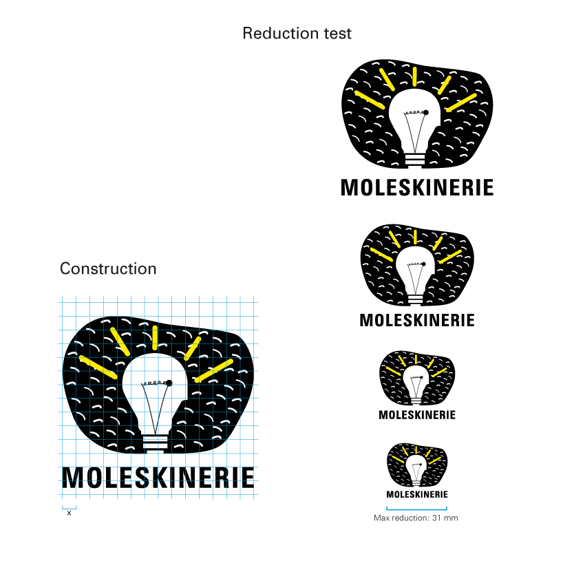 ConstructionReduction
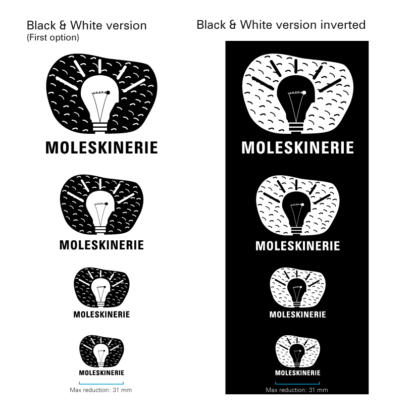 BlackWhite
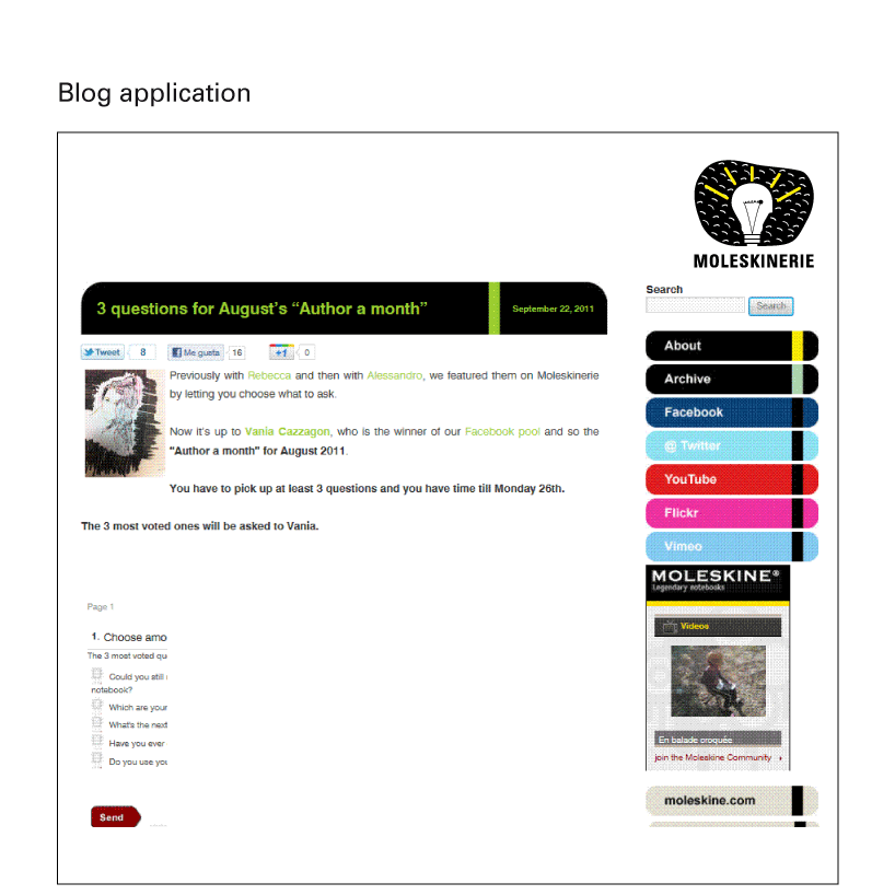 BlogApp
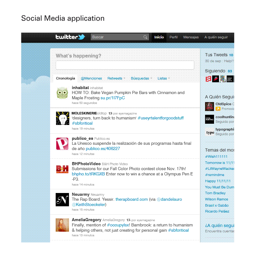 SocialMediaApp