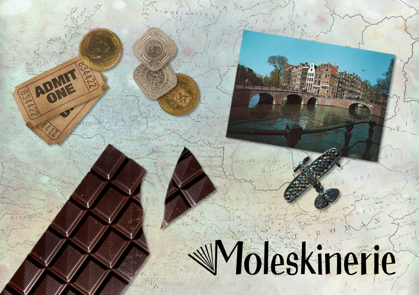
moleskinerie: a library of fun memories and expressions by luisa henke from brazil
designer's own words:
When I created the proposed logo, these were the main concepts I wanted to bring through: diversion, emotion and cheerfulness. I tried to reflect these concepts as I developed the typography, keeping it in mind from the start. With a slight allusion to the past, I referred to some display fonts with influence from the 50’s and 60’s.
Further developing the notions of fun and cheerfulness, I wanted somehow to show the product. The notebook attached to the letter “M” not only symbolizes the product, but the variety of memories which can be registered in a Moleskine or in the Moleskine blog. My intention was to design the pages of the notebook in a language which is coherent with the typography.

shortlisted entries (2162)