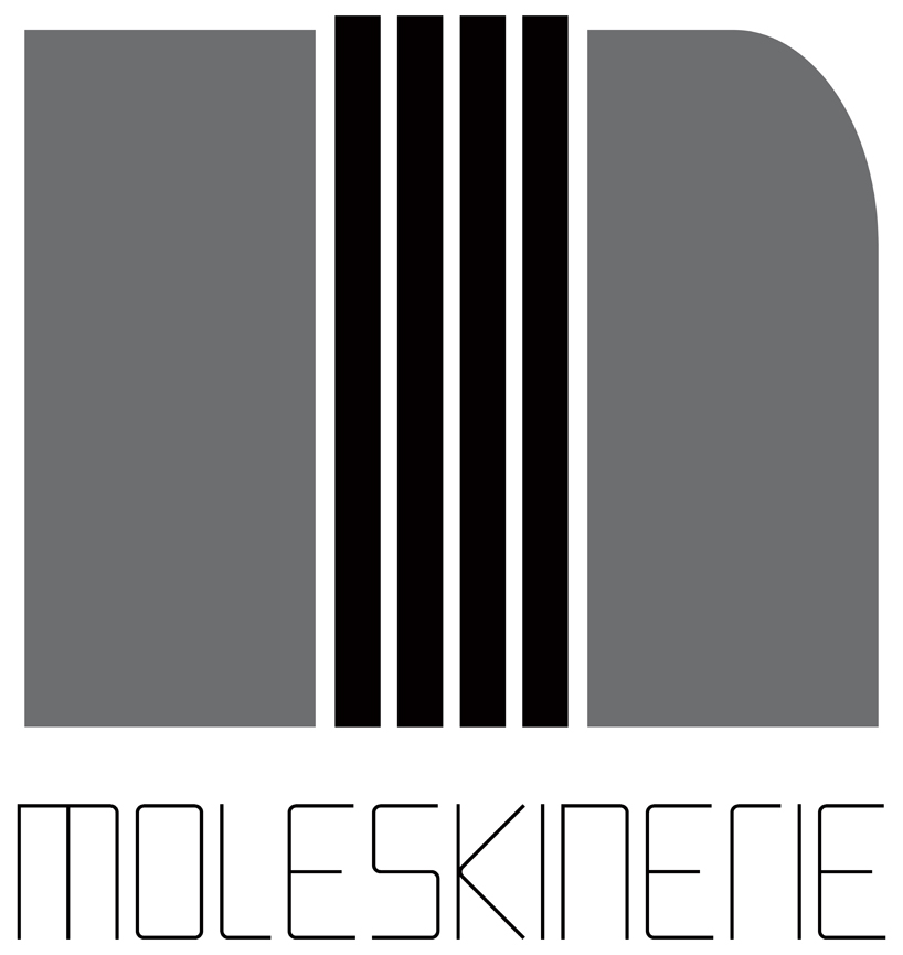
moleskinerie by gabriel pedrosa from brazil
designer's own words:
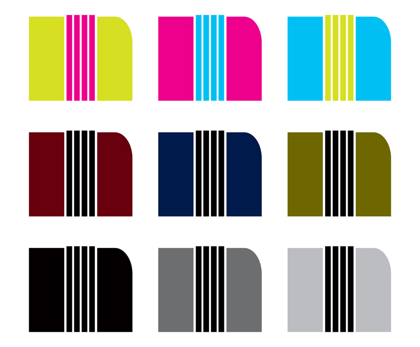
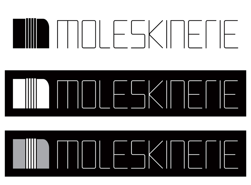
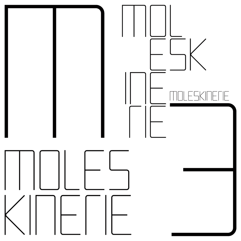
the iconic rounded corners of the moleskine notebooks were used to create the typography in which this project is based. besides de font, an graphic logo was created to resemble both an "m" and the upper-right corner of a moleskine notebook, with its rounded corner and its elastic strip.


shortlisted entries (2162)