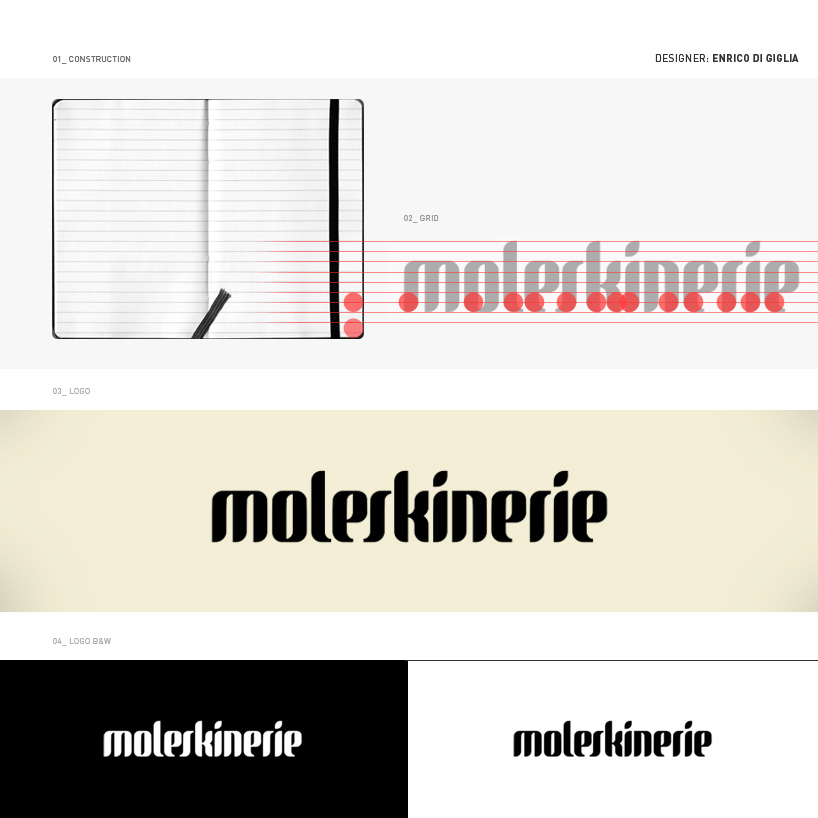
moleskinerie by enrico di giglia from italy
designer's own words:
my moleskinerie logo is based on what i called "moleskine grid".
the grid i designed drew inspiration from the famous moleskine cahier and agenda, and is composed by two simple modules:
circle ( original rounded moleskine corners)
straight lines ( ruled layout page)
using these two elements i created a kind of ratio.
this gave me the key for a typographic research, in order to find a font that could match my criteria.
after several attempts, i came up with a font that worked well the grid.
i had to customized few lines and finally i made this working.
final result is a typographic logo celebrating the "face" and the original famous moleskine shapes.
thanks
enrico di giglia
logo
shortlisted entries (2162)