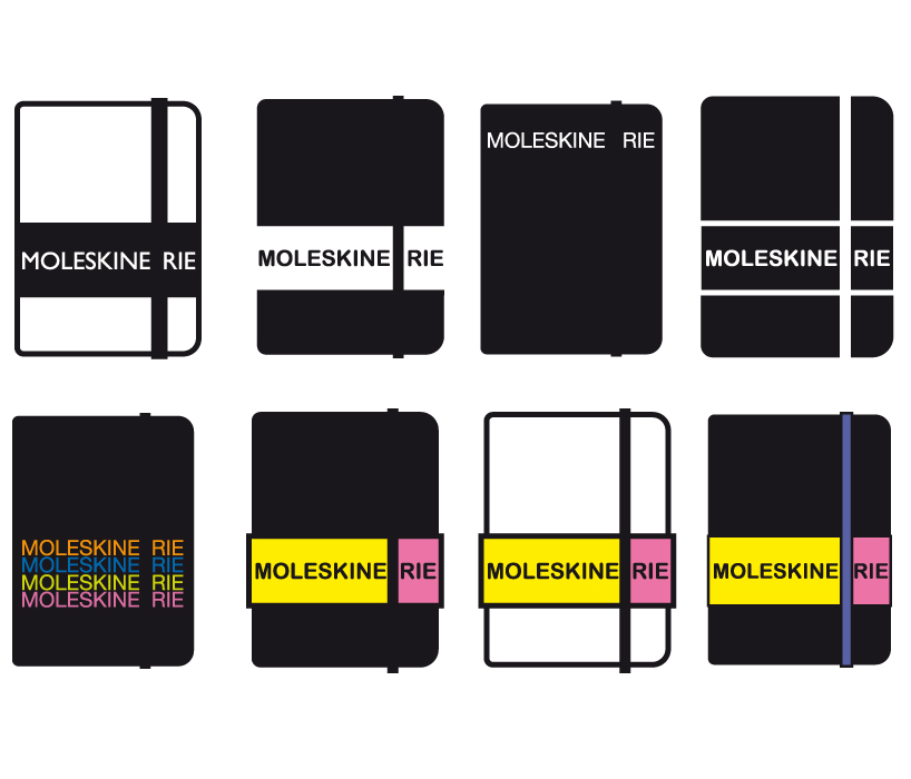
moleskine&rie by giovanna molteni from italy
designer's own words:
the idea is very simple. the word '' moleskinerie'' lives on the surface of the icon and is cut into 2 parts. So you will read first moleskine and then moleskinerie.
it's ok in black and white but also you can fill it with the colours and then enjoy it.
straight|easy|moleskine&rie
moleskine&rie
shortlisted entries (2162)