MOLEskinerie by Irina Mihaela Bogdan from romania
designer's own words:
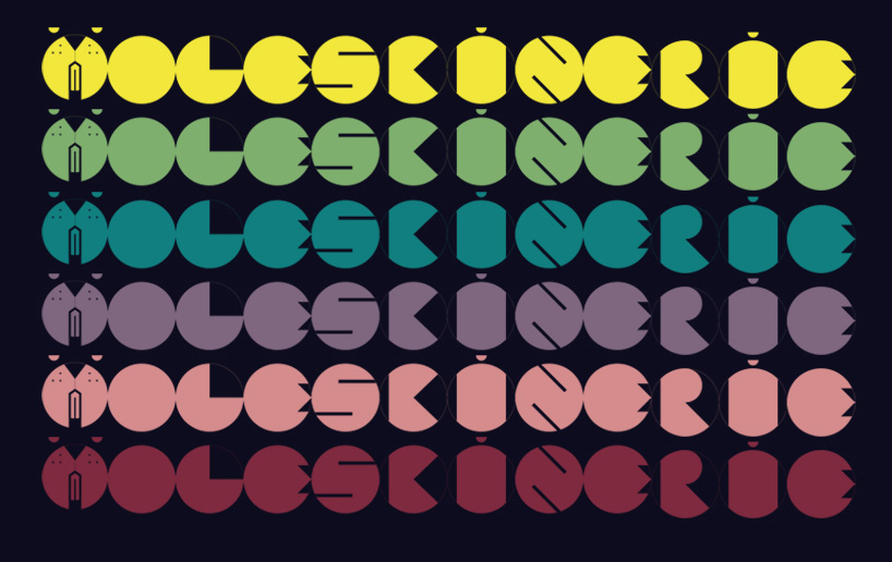
the concept of the logo started from a pretty straight forward idea: dig for ideas. in order to represent this in a direct manner, i chose as an iconic figure, the head of a mole. after working on the symbol and simplifying it, the mole head turned into the letter m, head-character for moleskinerie.
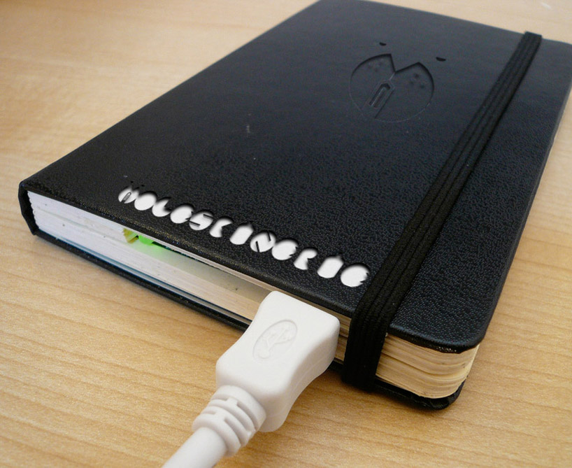
due to its simplicity, the logo is customizable. it can have any colour, it can be reproduced on any given surface and from any given material(textile, concrete, leather, wood etc.) by using common technology.
feel free to improvise!
logo
 symbol
 colour
 applied
shortlisted entries (2162)