moleskinerie+ by ana luisa bouza from portugal
designer's own words:
in the ambit of the competition to create a new logo of moleskinerie, the moleskine blog, i present a proposal initiated from the classic formal values inherent to this historic brand: “little black notebook,” “a simple black rectangle with rounded corners”...
considering the premises established, it was necessary to develop an effective image which can provide an immediate reading and be widely acknowledged and universally adaptable.
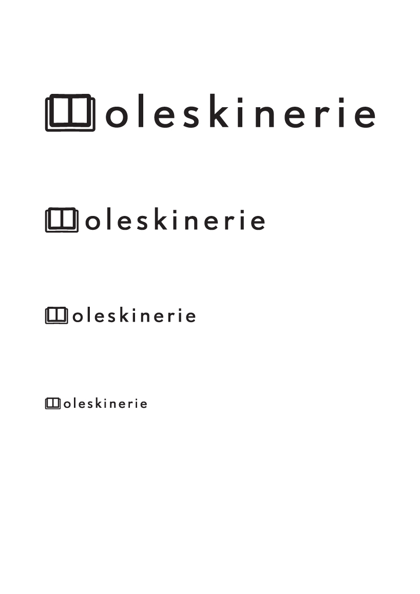
the image created consists in the word moleskinerie where the “m” is also a moleskine notebook stylization. This graphic element can work as part of the name of the blog, or/and alone. in all cases, instantly recognizable.
its simple, solid, and robust form, is clearly delineated, meeting the current dynamic creative. follow, at the same time, classical principles of composition - horizontally reading -, and color - black only -.