Moleskineri pit by pedro bellido from spain
designer's own words:
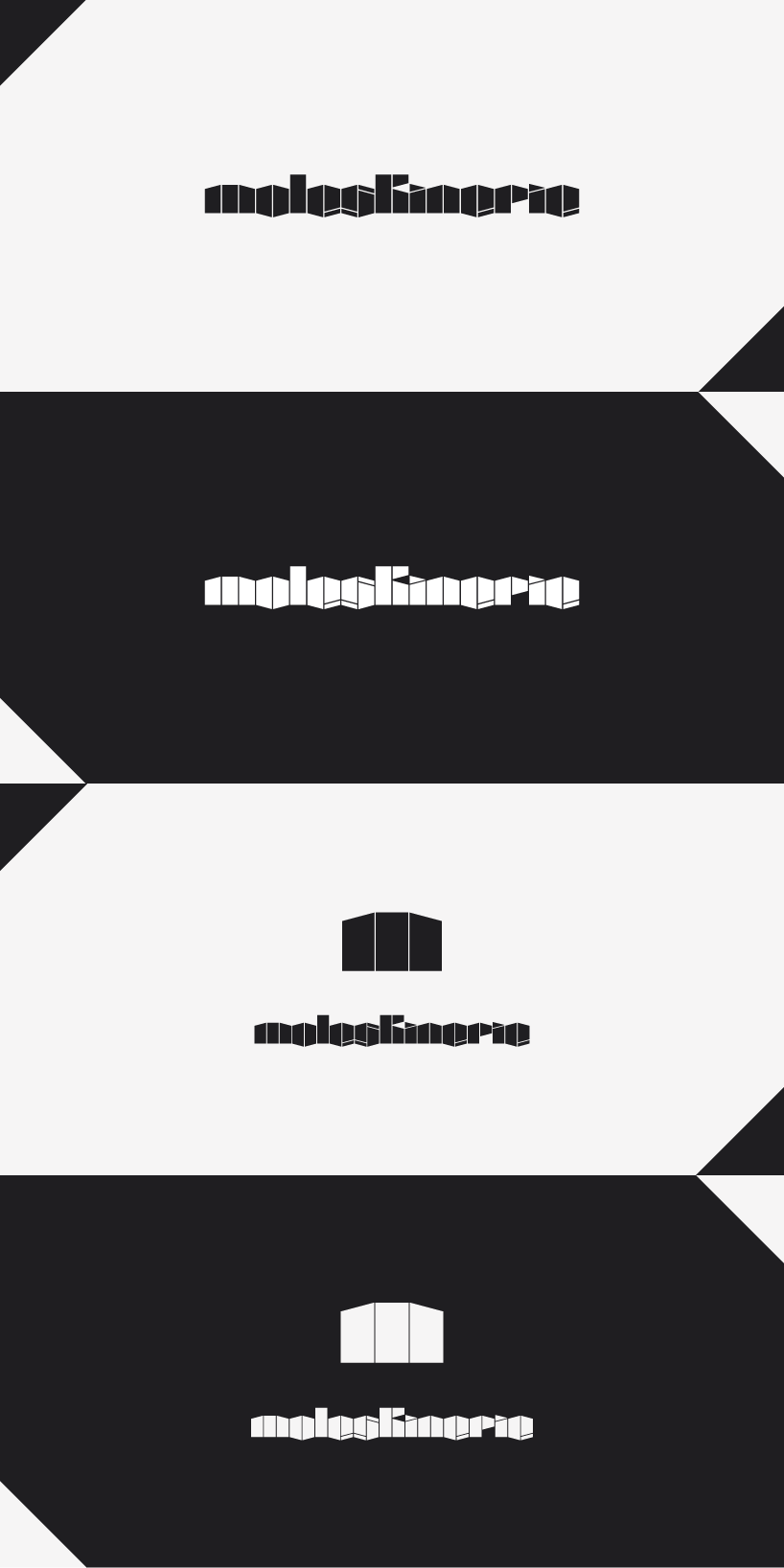
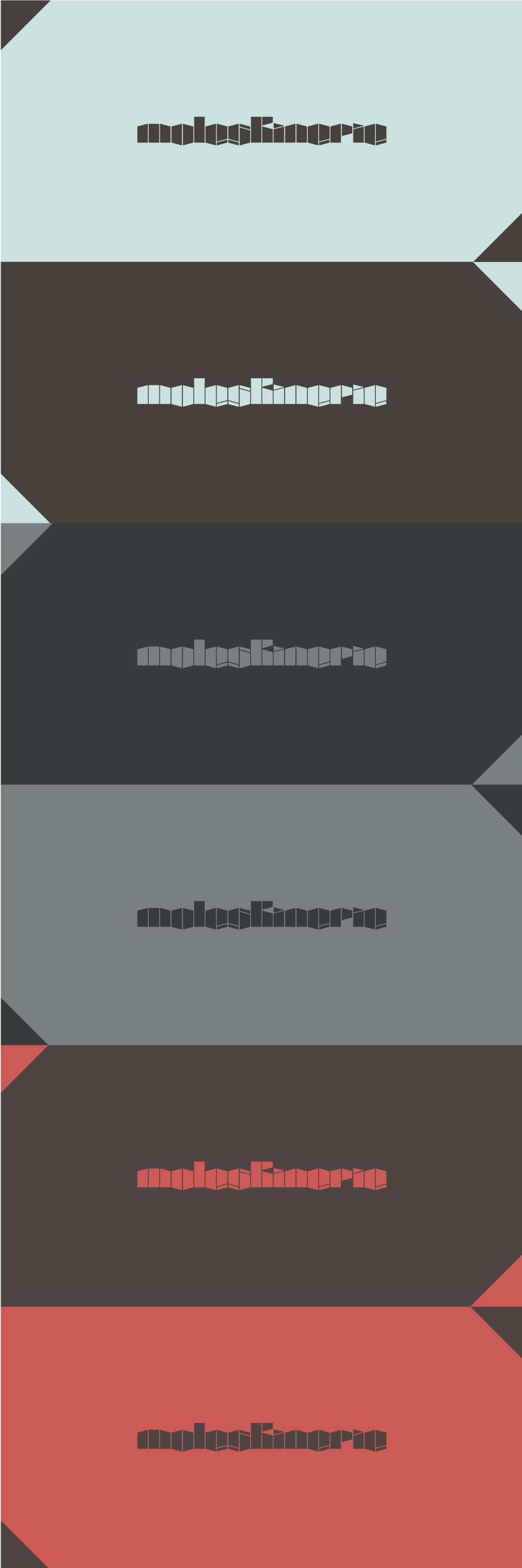
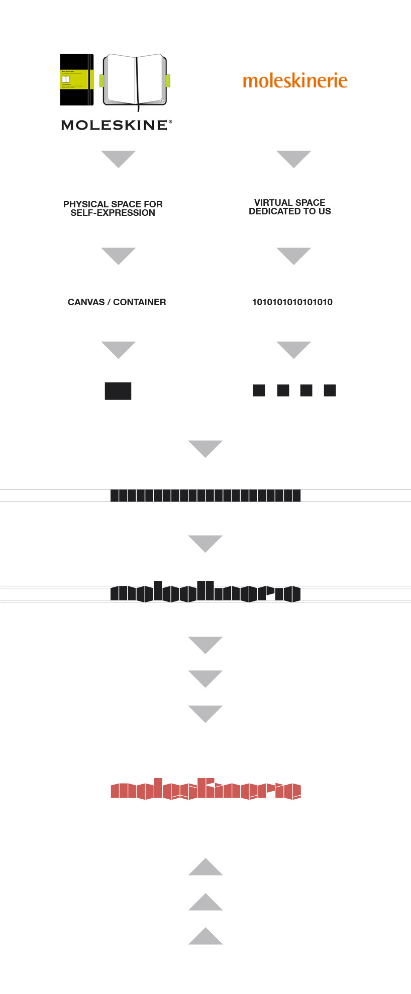
this logo is inspired by the self-expression world to which invites us moleskine and by graphic and geometric representation of binary code. based on the concept of a large blank canvas formed by various moleskine notebooks opened next to each others, this logo combines symmetry and cleanness along with charm and personality. though this logo is for web/devices purposes, it had to be thought for print too: when reduced it does not affect its legibility nor comprehension. the moleskinerie blog has a simple design. it changed few days ago, but it kept its flexibility and openness to the logo design. last but not least, this logo built on the concept of a fake perspective to express open notebooks viewed from the top, was thought in black but could be seen in other colors. find the proposals in the above.
B&W Logo
 Color Logo
 Inspiration proccess