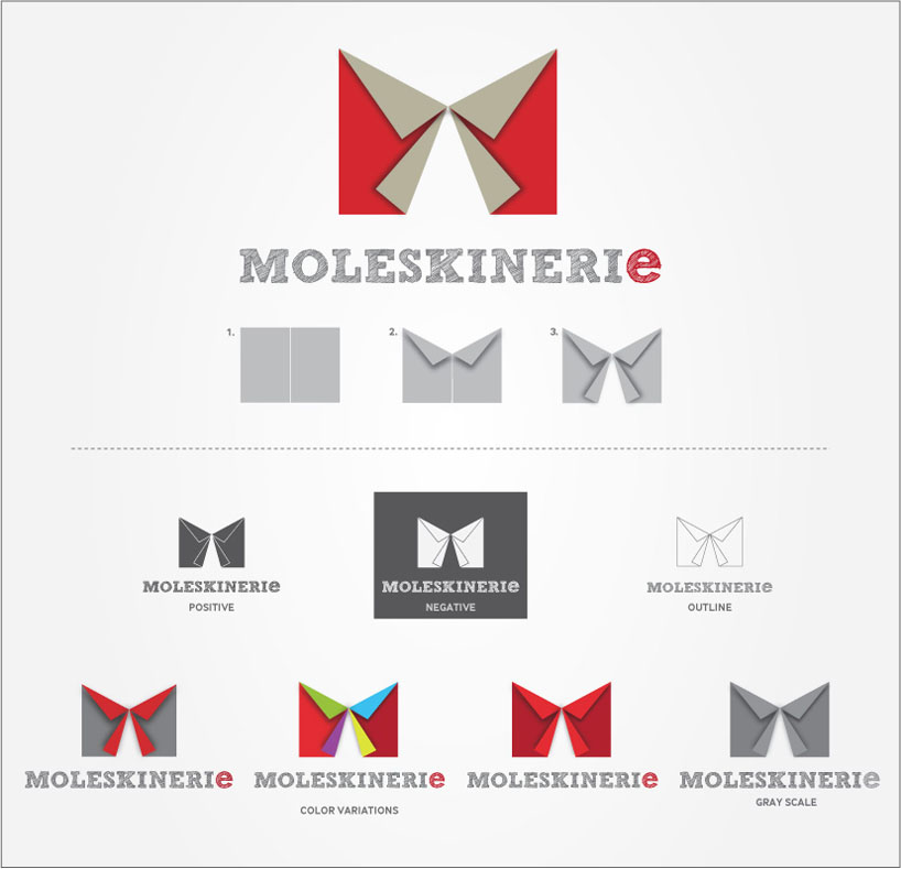
moleskineri e by milorad radak from serbia
designer's own words:
this logo is inspired by paper that is the main ingredient of most moleskine products. the logo is composed out of two sheets of paper folded to create letter m – it is very simple and versatile. also, it can be easily created from real paper sheets, try it yourself!
in the logotype moleskinerie the small letter “e” is emphasized in order to suggest Internet or a blog. i have used sketchbook font in order to further accentuate the nature of moleskine products.
shortlisted entries (2162)