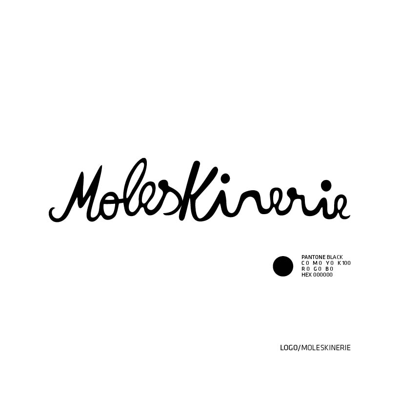
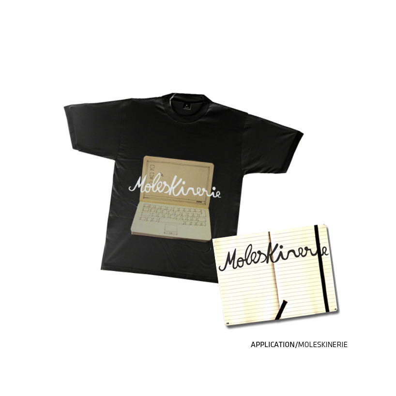
moleskinecallygraphicrie by Pilré Marta from portugal
designer's own words:
the logo is the expressive look on the benchmark "moleskine".
the manuscript touch gives the brand a natural appearance and confident, to humanize that and bring to the public a impression of trust and closeness.
black color give us a sense of continuity and quality.
shortlisted entries (2162)