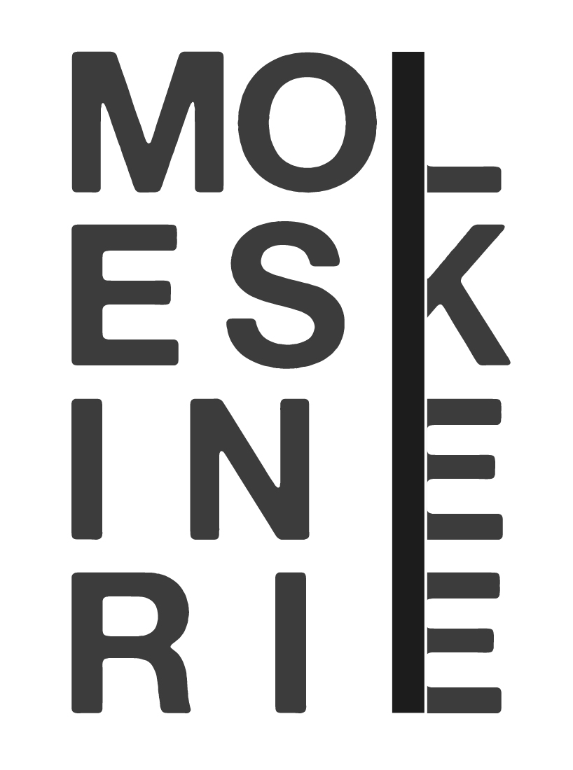
Moleskine style by cristina pagès solé from spain
designer's own words:
It's a logo as simple as using the so familiar shape of moleskines, to fit the letters of Moleskinerie in it. Also the line of the third letter of each row, coincides with the typical elastic band of the moleskine notebooks.
shortlisted entries (2162)