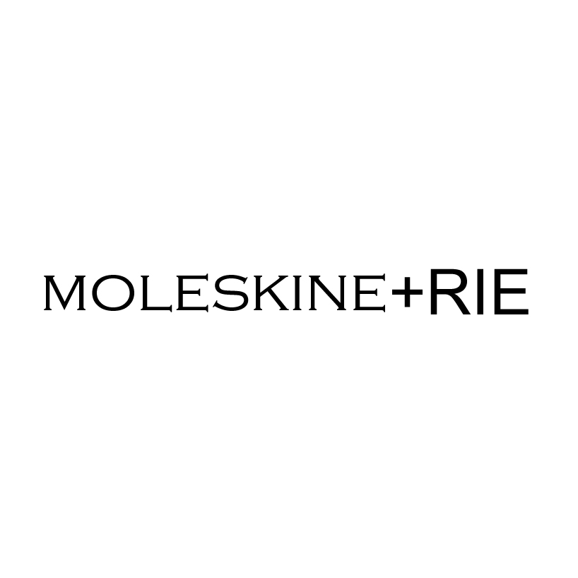
moleskine+rie = moleskinerie by Josmar Azzopardi from malta
designer's own words:
the logo is a clean text-based logo.
the logo is quite straight forward as it reads moleskinerie. the idea to incorporate the +
symbol is derived from the simple fact that the official blog is an extra [bonus] feature
that moleskine provides to designers, writers and artists.
black vs white
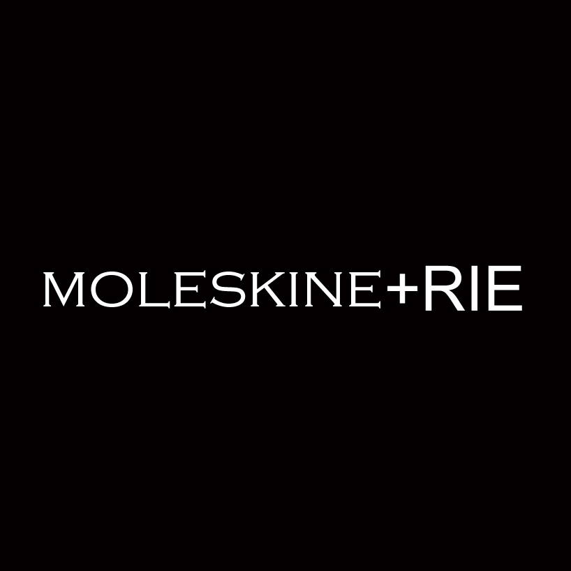 white vs black
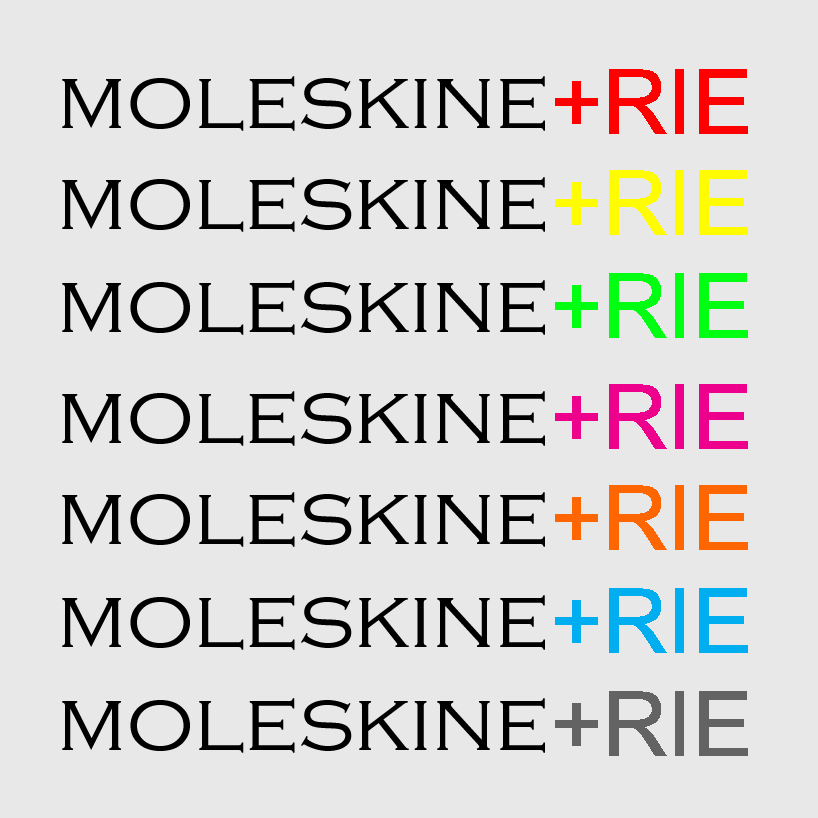 different colour schemes
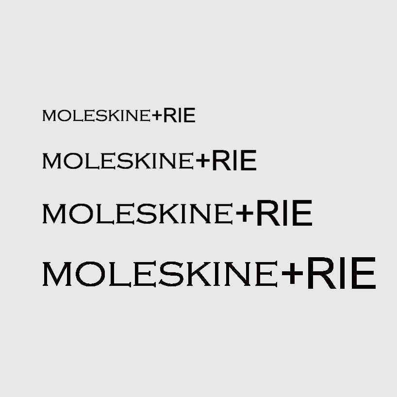 sizes
sizes
shortlisted entries (2162)