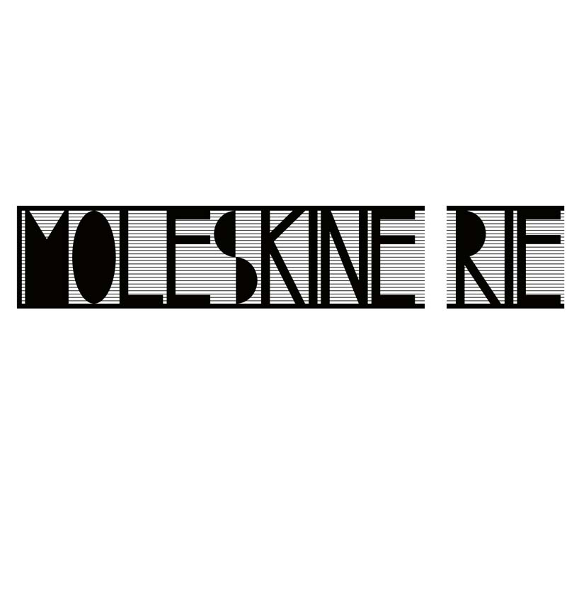
moleskine rie by martin dohnalek from uk
designer's own words:
I do understand moleskine notebooks not just as an ordinary pads but as a unique personal space for its users.
the concept was to come up with something easily recognisable which will stand up, would represents what moleskine stand for, but be less formal than the currently used sign and therefore suit better the fans blog.
that is what i tried to reflect in my proposal.
the design of the logo derives from the main features of moleskine pad - elastic band, smooth and rounded corners, black color and its users free-minded individuals.
the logo itself illustrates the notebook from a side view and with its elastic band, which holds all the ideas safely together represents the private space of its users.
the elastic band, this small gap in the text of the logo shows just how close is the fan base to the brand.
as the moleskine pads are available in different colors and sizes also the logo comes in almost unlimited variations.
it is suitable for web use and print.
the smallest recommended size for printing is 1cm x 1cm
basic version
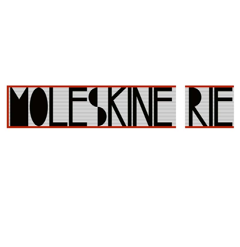 cover version – red
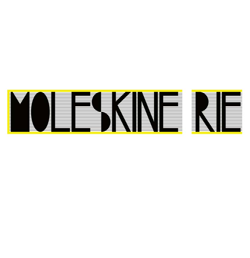 cover version – yellow
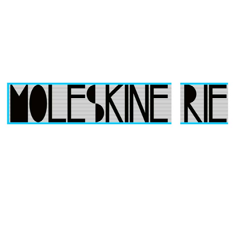 cover version – blue
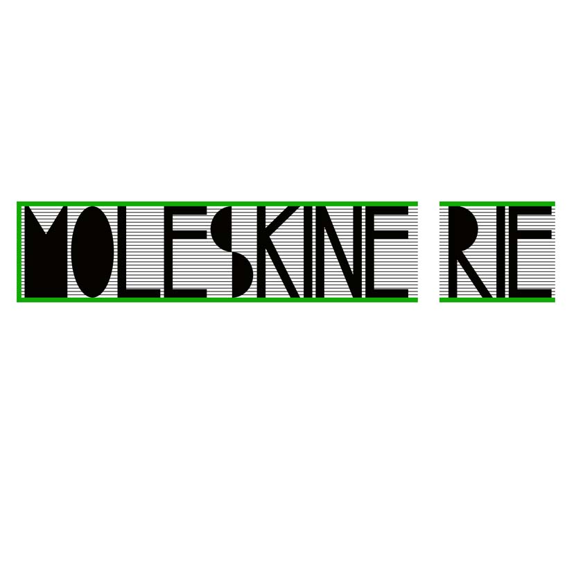 cover version – green
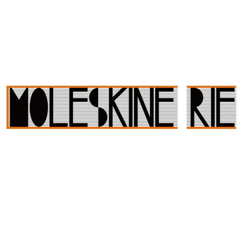 cover version – orange