moleskine + rie by andrzej jakuszko from poland
designer's own words:
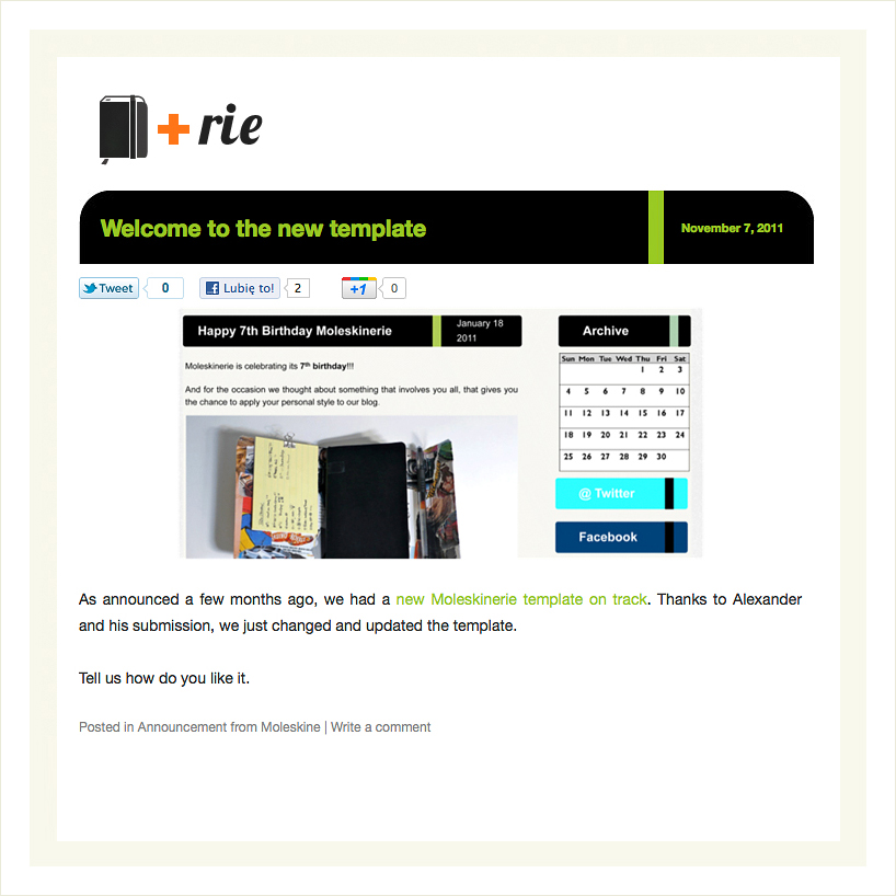
the logo is composed of trade mark - moleskine's notebook and postscript 'rie' linked with plus sign. moleskine's products are as much characteristic, that everyone, who keep in touch with them is able to solve the rebus with no difficulty, reading entirely as moleskinerie. the logo has a simple structure and can be easily applied on different types of materials, both bright and dark background.


shortlisted entries (2162)