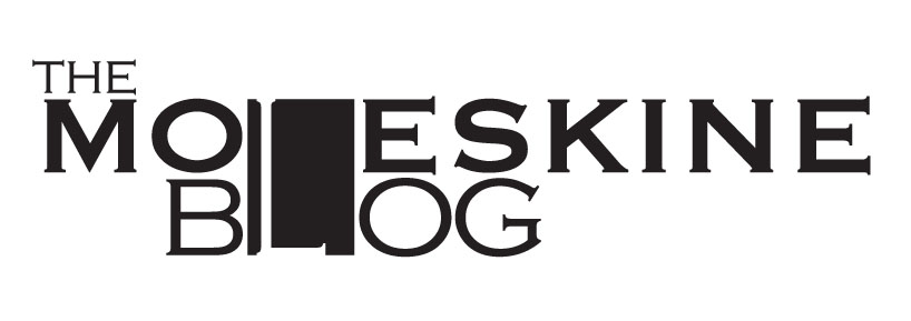
moleskine blog logotype by Reham Alsindi from italy
designer's own words:
this is a logotype for the new blog, i have combined the letter L for both words, the black rectangle represent the notebook with the rubber elastic on the side because this is their signature.the letter L is the rubber band usually appear in the notebook,
shortlisted entries (519)