Moleskine by ana raquel c. m. pereira from portugal
designer's own words:
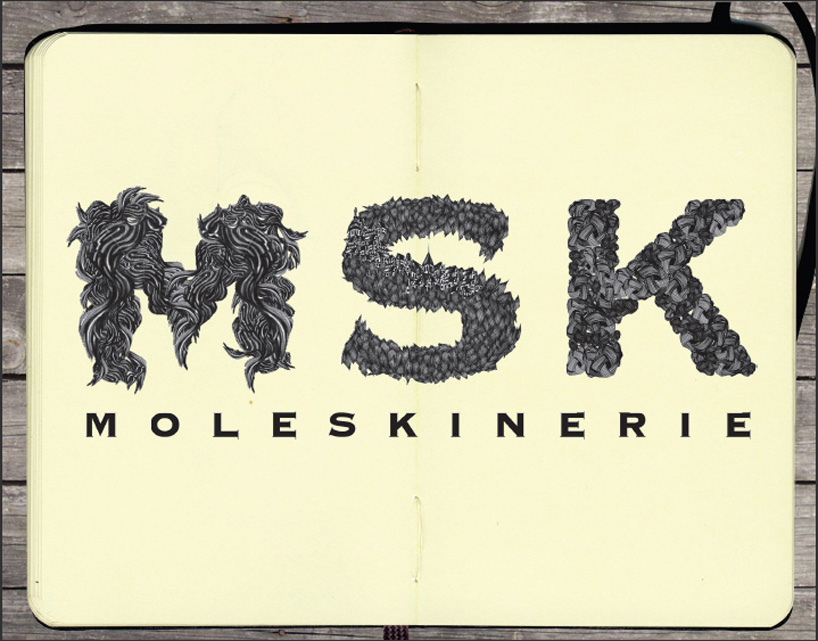
through illustrations chosen removed a detail of each illustration and typography created the stain with the repetition of the same detail.
we chose the same typography for their market power, which should be recognized by all. the "MSK" adapted the same sans serif typography but not to create visual noise.
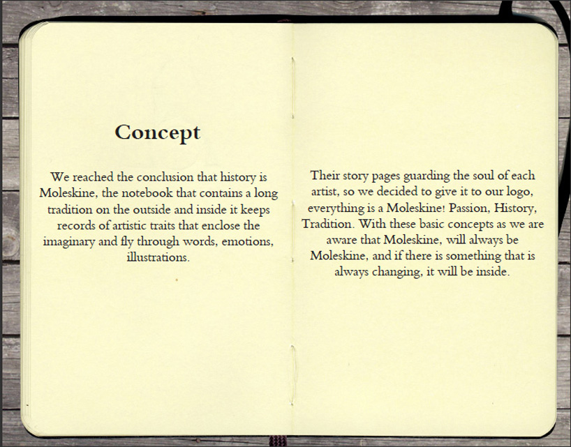
We reached the conclusion that Moleskine is history, the notebook that contains a long tradition on the outside and inside and keeps records of artistic traits that enclose the imaginary and fly through words, emotions, illustrations. Their story pages guard the soul of each artist, so we decided to give it to our logo, everything is a Moleskine! Passion, History, Tradition. With these basic concepts as we became aware that Moleskine, will always be Moleskine, and if there is something that is always changing, it will be its inside.