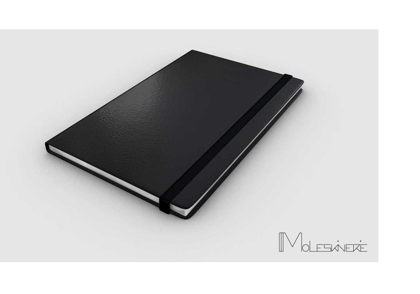
moles skin by monika maslanek from germany
designer's own words:
‘moles skin’ logo was inspired by the books’ backs lying on a shelf and diversity of moleskine’s products. The logo is simplified and modern, interesting because of melted ‘i’ letters, and two dots breaking geometric rhytm, looking exactly like black moles on a skin.
moleskinerie ‘moles skin’ logo
 moleskinerie ‘moles skin’ logo
shortlisted entries (2162)