"molerskiner'ink" by Lionel Rosilio from france
designer's own words:
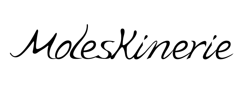
this proposal is a typography drawn in a calligraphic style.
on one hand, it evokes the sensitive curves of the handwriting, made of thin strokes and thick strokes , and on the other hand it opposes itself to the stiffness of paper, the base of moleskine's notebooks, which offer comfort and stability essential for the pleasure of writing.
here the paper takes the shape of geometric html on a blog page, and i wanted the logo to oppose itself to this geometry, to emphasize the authentic value of the drawn handwriting, thus expressing the idea of an interactive notebook.
this proposal offers two forms of interpretation:
a typographical one with a handwritten identity, and a graphic one in the form of a logo, recapturing the dot on the "i" suggesting a drop of ink in which the first letter "m" of moleskinerie is used as an identity on its own.
the typography and the graphic logo symbol can be associated in the same proposal, but the logo may also be used on its own.
the typography of this proposal can be adapted to different graphic applications or styles. my first proposal is conveyed in ink but one can also imagine it engraved on leather, on wood, on paper or on other natural and worthy materials.
this proposal was elaborated and conceived from handmade drawings in black marker which were then scanned, vectorised and retouched in order to find the right balance between harmony and fluidity. finally it was redrawn with vector brushes to create a spontaneous trace with a wash drawing effect.
typography drawn and vectorised in calligraphic style
![]() typography and graphic logo
typography and graphic logo
 graphic variations
 material proposals
 ink proposals
 moleskinerie blog identity