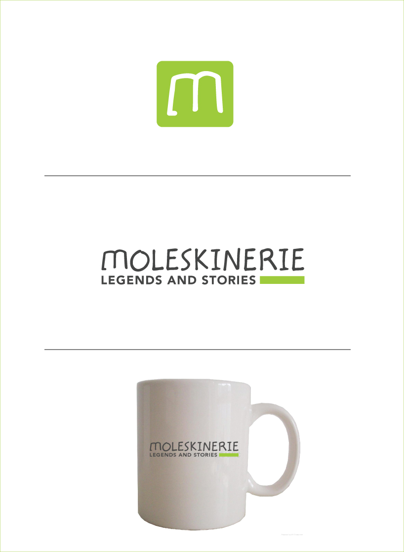
Moleksinerie_logo by Akin Bacioglu from sweden
designer's own words:
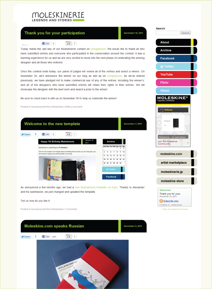
moleskine users (moleskıneries) was the inspiration for the design. Most of them use these sketchbooks for sketching and taking small notes. That's why, my logo has a sketchy look. Other than this, "m" letter at the beginning is a stilization of an open sketchbook from top which can be used as icon also. Finally, the logo has a rectangle at the bottom right which refers to elastic bands of the sketcbooks on the front page. this idea is also used in the moleskinerie.com website. When they are combined at the website they perfectly fit each other.
moleskinerie_1
 moleskinerie_2
shortlisted entries (2162)