Molekine(rie) logo by RikoStudio by riko studio from france
designer's own words:
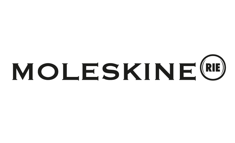
The Moleskine Notebook is a world itself. A strong brand universe. Moleskine embody several worth such as humanism, journey & History. This universe is in the strong brand identity that ends with the ®, the tramedmark, that put the main product and the brand into the "real" world.
The ® is closed, cannot share anything, he is the object in our pocket. The RIE comes and chase the trademark. He invites you for a journey in a new molekine's world, the Moleskine digital Universe: The Moleskinerie. We took the "classic" logo and put an bubble of freshness. The "rie" bubble goes with the new digital ambitions of the brand.
The Moleskine's logo is black 100% since it is an object, a notebook made of sheet of paper. A light gradation in the web version goes with the support's adaptation. You can declinate a lot the colors of the bubble, in function of the support.
We hope you'll like it
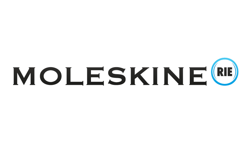
Moleskinerie Logo
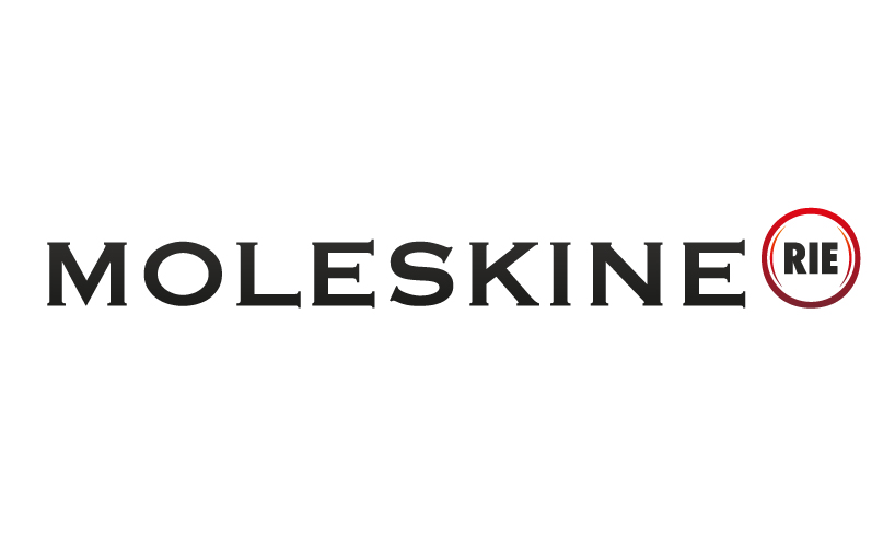 Moleskinerie Logo Red Variation
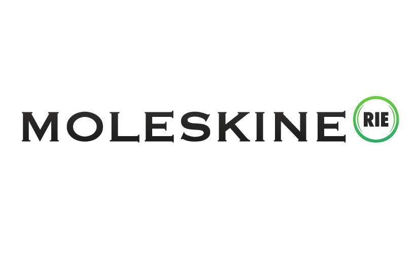 Moleskinerie Logo green variation
 Moleskinerie Logo blue-green variation
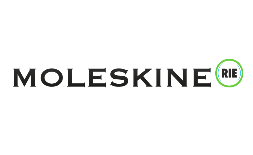
 Moleskinerie Logo green-blue variation
 Moleskinerie Logo black & white