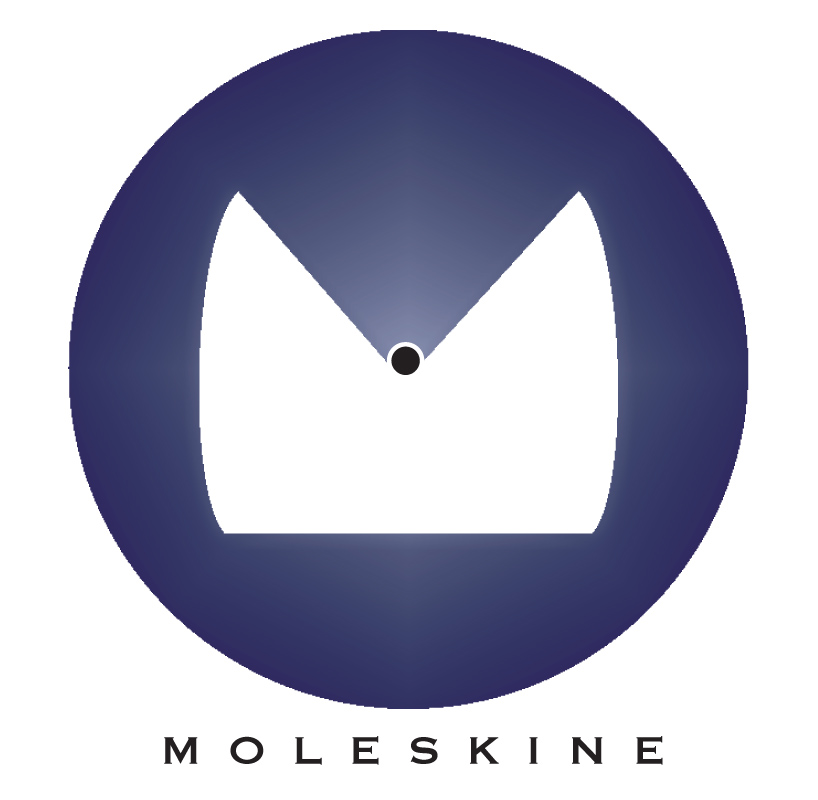
Mole skininerie logo by clancy gibson from uk
designer's own words:
With this logo, I aimed to amalgamate the letter 'm' with the shape of a mole creature. I looked at trying to use the shape of the Mole to suggest the letter 'm'. Eventually it was decided to use the mole's long pointy nose to create the crotch of the letter, then the letters shape was creates within the white space.

shortlisted entries (2162)