MK2 by martin holzhauer from germany
designer's own words:
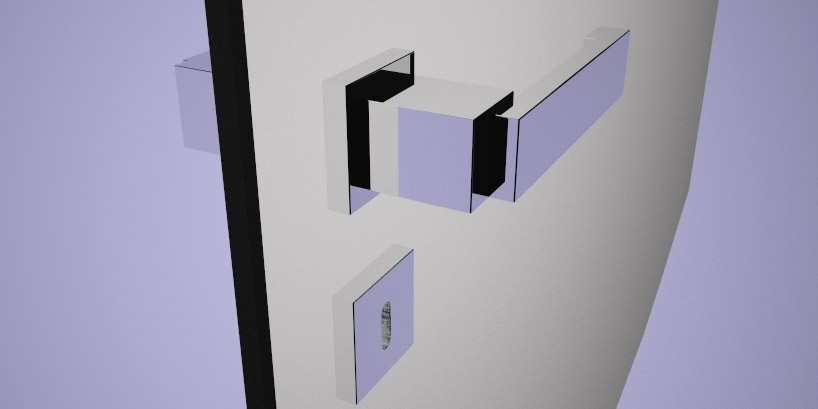
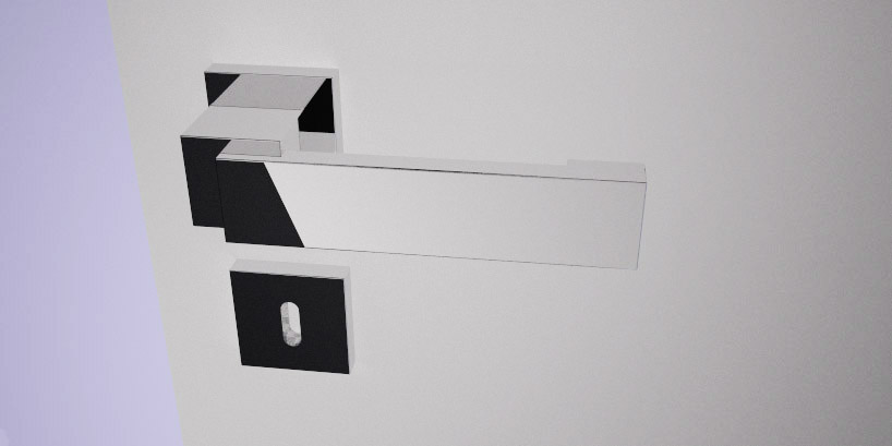
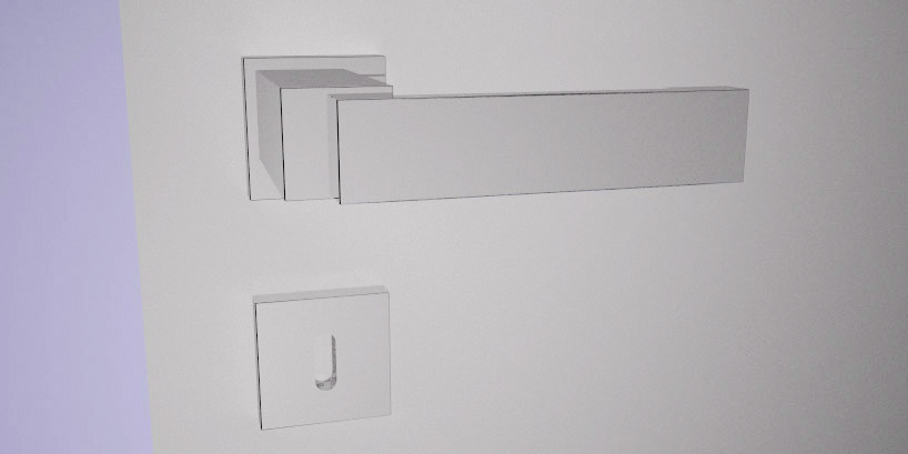
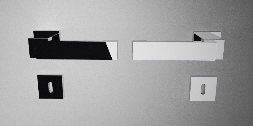
the primary form of the mk2 doorhandle is quite simple. it combines heavy and light apperance, the rather thin handle sets contrast to a massive socket. especially in a frontal perspective the mk2 appeares quite massive intensified by the lowered positioning, slighly out of the middle. from top perspektive the handle reveales its light nature. the chrome finish gives the design its clean completion. all edges are rounded with a slight 0.5mm radius, to give a edged yet good feeling when handled.
perspective1
 perspective2
 perspective3
 front
front
 dimensions
shortlisted entries (4078)