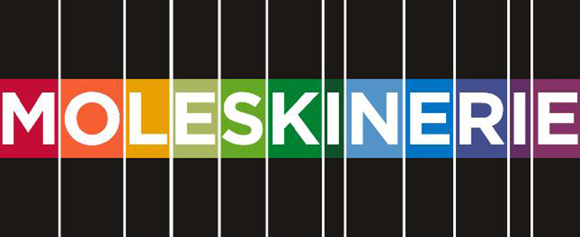
Minimalisrie by colejo gonçalo from portugal
designer's own words:
hello, my name is Gonçalo Colejo, I'm 21 years old and Designer. in this project I tried to create something simple, functional, and that resulted in any circumstance. I did not create any typeface purpose for this project, I think there are so many good typeface. the one I chose was the one used by Moleskine in your logo and other Gotham was in my opinion is the one that works best for this logo. as you can see in these examples i chose to create two types of logos, with only the source or with colored backgrounds / dark. colorful why? simply because there are different types of people who use Moleskine which in turn, that exist for different types of use. i could try to create something very scrawled in fact, but I think this is just ideal for the Moleskine's blog. thank you.


