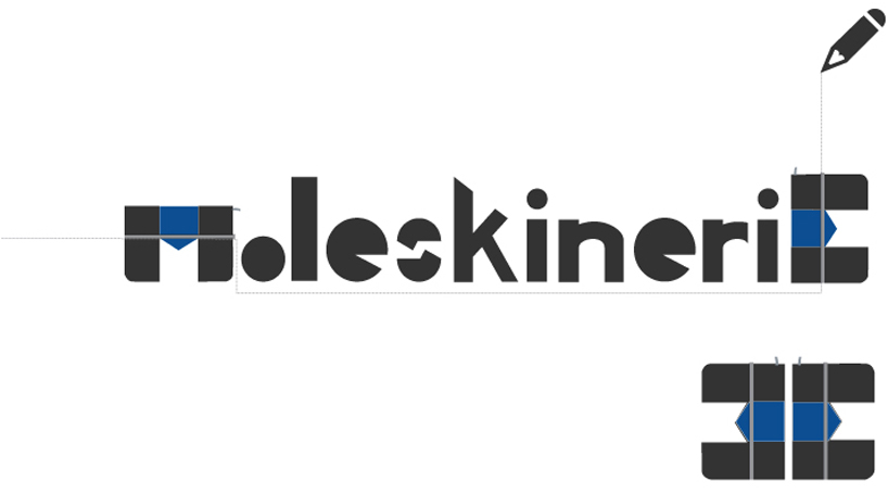
m...E by andreas alygizos from greece
designer's own words:
the proposal for the new moleskinerie logo is based on the thrifty lines that moleskine uses in the design of their products. the new form of a such a logo owes to repressent the main characteristic of moleskine, - the simple comprehensive design which established the products so famous. following that as a guide the new logo is a result of basic shapes such as circles and rectangle. all the letters in the logo , despite the fi rst and the last, one are based on a design strategy of how we can understand those basic shapes depending on the condition we are watching them. there are many ways of perceiving each one. used in a way like that they give us the meaning of a primary simplicity.the other two letters are the same, completing the start and the end of a circle road. they are the same such as the front and the back side of a notebook. they are one. the shape rises from the notebook. it reminds the notebook to the viewer. it is the bonding thread.