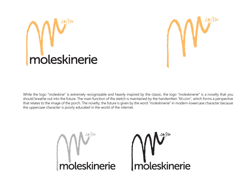
M.com by tommaso mandorino from italy
designer's own words:
while the logo "moleskine" is extremely recognizable and heavily inspired by the classic, the logo "moleskinerie" is a novelty that you should breathe out into the future. the main function of the sketch is maintained by the handwritten “M.com”, which forms a perspective that relates to the image of the porch. the novelty, the future is given by the word “moleskinerie” in modern-lowercase character because the uppercase character is poorly educated in the world of the internet.

shortlisted entries (2162)