mark your stories by tomas da silva from portugal
designer's own words:
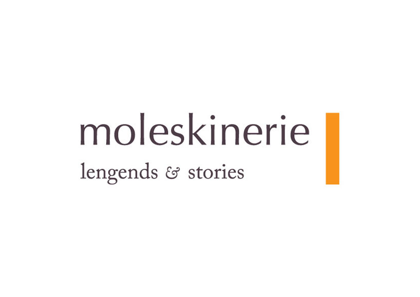
i wanted my logo to be based on typography. so i chose a humanist sans serif for the main word (optima) and for "legends and stories" caslon, because of the font's own story and the ampersand. the rectangle to the right represents a book marker, used by the reader to remember where he wants to go on reading. as far as colours go, for the letters, i chose a tone that would seem as if it were black, but faded out over time. and for the rectangle, i chose the moleskine orange.
shortlisted entries (2162)