maj by alessandro iurman from italy
designer's own words:
the blog is like a virtual notebook that collects a significant event or experience of a lifetime.
---
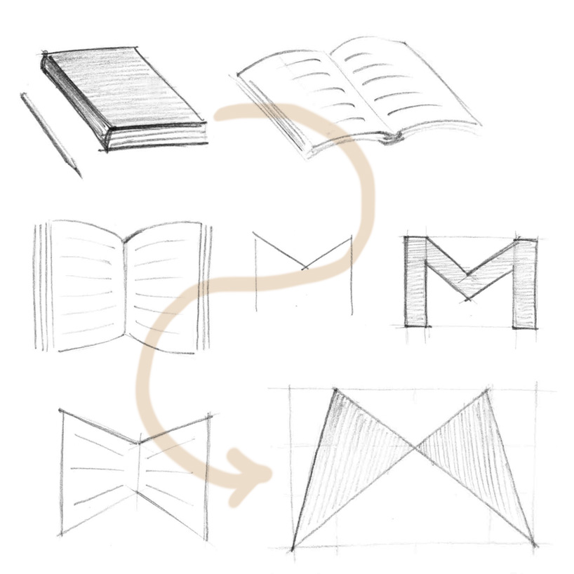
i started thinking about a block for sketches and notes because it's a central aspects of moliskinerie.
i developed the graphics subject and i tried to merge this idea with the letter "m" of moliskinerie.
as can be seen in initial concept sketches (img_6), a simple notepad opened in front of us, just waiting for creative gesture to become an incomparable support for ideas.
i have tried to simplify the geometry of the logo without losing the original idea.
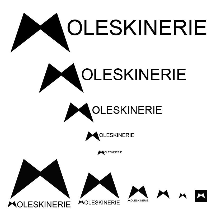
a simple design for a maximum versatility and reproducibility in different colors and dimensions.
logo in black on white has the better visualization at small sizes, but you can reproduce it in different monochromatic colors.
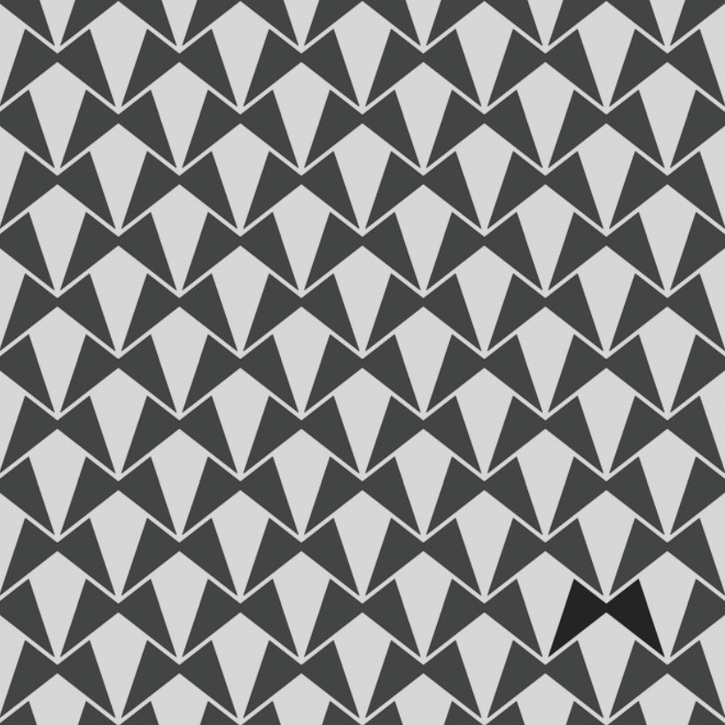
reproducing the logo in an infinite sequence creates a very nice pattern (img_5).
---
the principle of an idea is like a butterfly, do not know when it leans, but when it does it, this is wonderful.

