M notebook by Halei Liu from denmark
designer's own words:
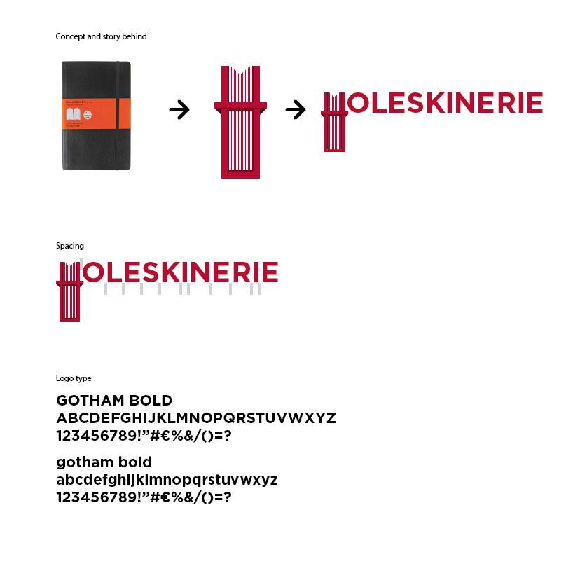
the logo is based on the form of the notebook itself. when people are reading through the logo, the product itself will be presented from the first blink.
the belt also added the unique personality to the brand, i added this not only because t want to differentiate the image from the other notebook, but it is also because the belt itself is a really special signature from the moleskine notebook.
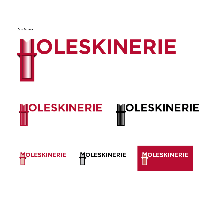
the logo can be used in different sizes in the perspective details (i only show 3 sizes, but it can extend to various of sizes by following the same principle). it makes the logo both recognizable and unique in different situations. by using the details, i mean to capture the true nature of the notebook, the paper itself.
i used the gotham as the basic logo typeface, it offers the product a more modern but serious image for the public. the geometric shape also allow me to explore the possibility on the product image.
M notebook logo
 concept and basic graphic concerning
 color and sizes
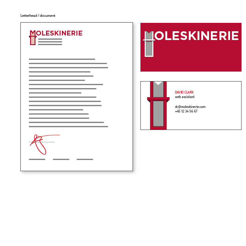
 logo on print
 logo on ad.
 logo on web